The football team Stoke City is based in Stoke-on-Trent, Staffordshire, the UK. Although its history started in 1863, of course, not all the logotypes the team has used since then have preserved.
Meaning and history
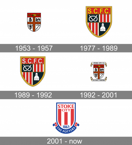
The logos the club was using in the second half of the previous century looked pretty loaded with details. They actually reminded medieval shields. This is especially true about the logo Stoke City used in 1953-1957 and 1992-2001, which even had a Latin motto on it.
1953 – 1957

The Stoke City insignia, designed in 1953, featured a traditional heraldic symbol as the only element. The white crest with arched sides had a dark red top part with golden ornaments and a bold Red Cross in the center. The cross was separating the shield into four equal segments, with black images in each of them. The images were: a vase, a camel, a heraldic eagle, and a scythe.
1977 – 1989
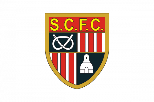
In 1977 the logo of Stoke City was redesigned. It was still a heraldic crest in red, gold, white, and black color palette, but in a completely different execution and style. The shield featured a thick golden outline and had its body divided into four segments — two boasted a vertical white and red pattern, and the other two were solid black. On the black square, there were white images — a rope and a tower. The upper part of the crest featured a solid red background and a bright yellow “S. C. F. C.” Inscription in a traditional sans-serif typeface.
1989 – 1992
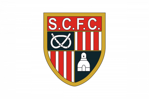
The redesign of 1989 was more about a refinement of the Stoke City visual identity. The bright yellow lettering switched its color to white, which made the whole crest more balanced and elegant. The red and white vertical stripes became thinner and the white element on the black background were redrawn in a smaller size.
1992 – 2001
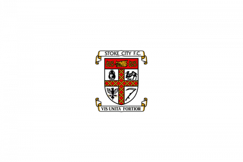
In 1992 the club decided to come back to its traditional heraldic logo from 1953. The crest was not changed at all but got two additional ribbons — above and under the main shield. On the upper white ribbon, there was an elegant serif “Stoke City FC” inscription in black capitals, while the bottom ribbon contained the “Vis Unita Fortior” motto in Latin, which can be translated into English as “United Strength is Stronger”.
2001 – Today
While the Stoke City FC logo adopted in 2001 pays homage to its predecessors regarding the overall shape, it’s much simpler.
Stoke City Colors
RED
HEX COLOR: #E03A3E;
RGB(224,58,62)
CMYK: (6,92,79,1)
BLUE
HEX COLOR: #1B449C;
RGB(27,68,156)
CMYK: (99,85,3,0);


