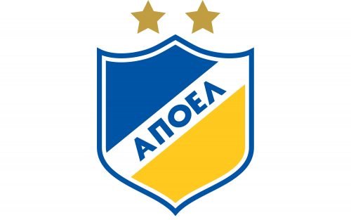
APOEL is the name of a football club from Cyprus, which was established in 1926 in Nicosia. The club, nicknamed “The Legend” ( “Thrylos” in Greek) is managed by Marino’s Ouzounidis, who is also the head coach of the team.
Meaning and history
The visual identity of the Cypriot football club has been very consistent throughout the club’s history. The team has been using one and the same logo for many years by now and it doesn’t see the need for changes, as the badge is very well recognized all over Europe.
The Apoel logo is composed of a classic crest in a double white and blue outline. The crest is diagonally divided into two parts by a wide white banner where the wordmark in blue is placed. The name of the team, written in Greek, “AПОЕЛ”, is executed in a bold strict sans-serif with straight distinct lines and sharp angles. It looks solid and very confident.
The upper part of the crest is colored in the same blue shade, as the wordmark, while the bottom part is bright yellow. This blue, yellow, and white color combination evokes a sense of energy and professionalism, showing the club as a reliable and experienced one.
Above the crest, there are two golden-beige stars placed. Due to their pale and calm color, they look very modest and do not overload the bright yet minimalist badge of the Cypriot club.


