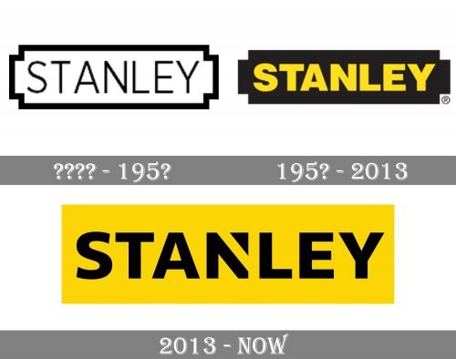
Stanley is one of the oldest and largest American companies in the world. The date of foundation is 1843 when Frederick T. Stanley and his brother William opened Stanley Works (the first Stanley’s Bolt Manufactory) to produce bolts, door latches, and other fasteners and door hardware.
Meaning and history
The history of the Stanley company and brand dates back to 1843. Then Frederick Trent Stanley founded the Stanley Company in Connecticut, USA. The initial specialization of the small company was the manufacture of locks, door hinges, and other hardware. After 14 years, namely in 1857, Henry, a cousin of Frederick Stanley, founded his own company, which was engaged in the production of rulers and levels. The two firms united in 1920 and formed a new large company, which would later produce the famous Stanley hand tools.
Today Stanley’s modern, state-of-the-art factories are scattered all over the planet. The USA, UK, Canada, Sweden, Germany, and others are involved in the production of Stanley hand tools. The quality of manufactured products is constantly monitored by the company’s central office.
Specialists rightfully consider Stanley a global player: the company is a multiple owner of awards and prizes received both in Europe and competitions of world brands. Every day Stanley Company improves its products. Special mention should be made of laser equipment, including laser levels, manufactured in the USA.
The range of Stanley products is more than 1000 items, which allows everyone to choose the right type of tool that meets ISO quality standards. By the way, the company has more than 150 patents for inventions. Reliability, ergonomics, and quality are indispensable attributes of Stanley products. The company’s motto is “Make something great!”
1857 – 1955
The original logo of the Stanley brand was introduced in the middle of the 19th century and stayed with the company for about a century. It was a clean distinctive lettering set in the uppercase of a geometric sans-serif typeface and enclosed into a horizontally-oriented rectangular frame with the interesting cuts of all four corners. The badge was set in a classy black-and-white color palette.
1955 – 2013
By the mid-1950s, the company already adopted the legendary black-and-yellow logo inspired by the battery shape. The battery was black and housed the name of the company in yellow. The writing featured a static, rather bold sans serif type, which could be interpreted as a visual representation of the reliability of Stanley’s products.
You can still come across this version on some older products.
2013 – Today
This version was developed by Lippincott and introduced in June 2011. The designers managed to modify the logo without completely losing its heritage. Due to this approach, the logo stayed recognizable for the customers.
To begin with, the original color scheme was preserved. Yet, now, the colors were reversed: the black was used for the lettering, while the yellow moved in the background. The shape of the letters remained pretty similar with a couple of subtle modifications. The distance between the letters grew a little larger. The most notable modification was probably the new “N” – due to the gap, it adopted a unique touch making the design recognizable. The battery theme disappeared from the Stanley logo.
Font and color
The bold geometric lettering from the primary Stanley logo is set in a distinctive sans-serif typeface with quite traditional shapes of the characters, and a unique “N” in the center. The closest fonts to the one, used in the Stanley insignia, are, probably, Core Sans N SC, or Humanist 777.
As for the color palette of the Stanley visual identity, it is a combination of yellow and black, the scheme adopted by the company in the 1950s. Black here is a symbol of quality and excellence, while yellow adds energy and power to the image.


