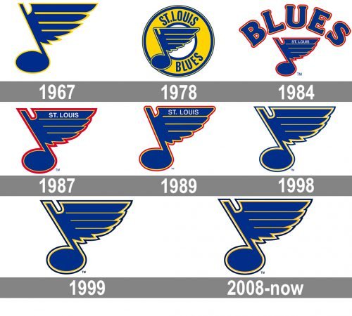
Since 1967 when the St. Louis Blues entered the NHL they have been keeping their team logo practically unchanged, unlike the majority of other teams. Though, some minor alterations have been made, of course.
Meaning and history
The Blues logo history is connected with music. Every citizen of the city of St. Louis where the Blues are based in answer to the question “What is the St. Louis Blues logo origin?” would say that the logo design was predetermined by the name of the team. At this point one more question arises: how did the team get this name?
For all those who love the blues, a genre of folk music, the answer is evident. St. Louis has always been known as a city of blues singers, and the owner of the team Sid Salomon Jr. came up with no other idea than to name the team “the Blues” to lay stress on the city’s tradition, its rich history and its spirit. Salomon also recollected W.C. Handy who composed his well-known song in St. Louis and named it “Saint Louis Blues”. He believed that the team of the city where everybody was singing had to be named like that.
The emblem the Blues boast of is a musical note in blue color. The choice of the symbolic element and its color is obvious and to include it in the logo design remains a tradition.
What is St. Louis Blues?
St. Louis Blues is the name of a professional hockey club in the United States, which was established in 1967 in St. Louis, Missouri. Today the club competes in the National Hockey League, has Enterprise Center as its home arena, and Craig Berube as the head coach.
1967 — 1978
The first Blues logo which was in use from 1968 till 1978 represented a light blue musical note with a wing to the right of the stem.
The meaning of the wing is symbolic. The players wanted their logo to feature something related to hockey, and the wing was to render movement and dynamism which are characteristic of the game. The viewer’s attention is drawn by the yellow outline. The logo immediately got the name “the Note”.
1978 — 1984
The recognizable note was placed against a yellow circle with the wordmarks “ST.LOUIS” at the top and “BLUES” at the bottom of it, both in blue color. Though, the note itself was not quite the same. The angles became softer, and a blue outline was added to the yellow one.
1984 — 1987
In 1985 the team removed the yellow circle and placed the wordmark “ST.LOUIS” on the top of the wing (it was in white). “BLUES” was now above the note. The letters were large and they formed a semicircle. The Blues also introduced a little of red as an outline to all the elements and preserved it for 15 years.
1987 — 1989
Two years later the note grew in size. Now it was the only element as “BLUES” with its domineering font disappeared from the top.
1989 — 1998
At the beginning of the 1990s a new version of the symbol was unveiled with some small changes. Thus, the note became more rounded, which gave it more bulk, and the red outline was made thinner. But the note looked somewhat off-balance.
1998 — 1999
In the version of 1998 they played with the color making it darker and dropped the red outline. Simplifying the color palette worked great.
1999 — 2008

On the whole, the winged note looked more refined now. The wing was extended in length. The angle between the note’s stem and the bulb was made smaller. These small changes added movement and dynamism to the image.
2009 — Today
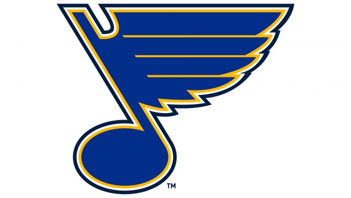
The current logo introduced in 2009 seems to be the best of all the previous images. No wonder it is the fourth best logo in the NHL. It looks simple and at the same time complex displaying the blue note, the wing and the outline which consists of three colors ‒ yellow, white and blue.
The design concept hasn’t considerably changed over the years of the team’s existence. Still the alterations have led to a more intense and graceful look.
Colors
The Blues logo color scheme consists of navy blue, sometimes referred to as Oxford blue, resolution or royal blue, white and Spanish yellow.
BLUE
PANTONE: PMS 287 C
HEX COLOR: #002F87;
RGB (0, 47, 135)
CMYK: (100, 75, 2, 18)
YELLOW
PANTONE: PMS 1235 C
HEX COLOR: #FCB514;
RGB: (252, 181, 20)
CMYK: (0, 31, 98, 0)
NAVY BLUE
PANTONE: PMS 282 C
HEX COLOR: #041E42;
RGB: (4, 30, 66)
CMYK: (100, 90, 13, 68)
WHITE
HEX COLOR: #FFFFFF;
RGB: (255, 255, 255)
HSB: (42, 0, 100)
CMYK: (0, 0, 0, 0)


