The Parker Pen Company is world-known for its luxury pens. The company was founded in 1888 in Janesville, Wisconsin, US. Since 2011, it has been headquartered in Nantes, France.
Meaning and history
The full Parker logo is rather complex. On the top, you can see an emblem made up of an ellipse broken down into two equal parts by a feathered arrow. The arrow is used as a symbol of the company’s signature product – the fountain pen. Both the two parts of the oval resemble a stylized “P.”
Below, there is the name of the brand in a sans-serif typeface.
Logo as seen on the pens
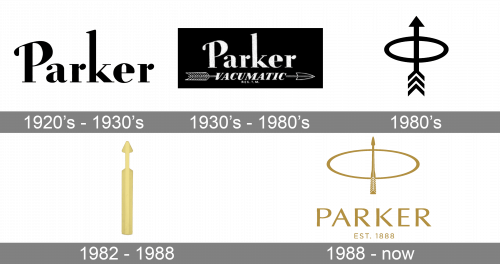
1920s — 1930s
On such models as Parker Duofold Flat-Top Pens (1921-1929) and the True Blues (1928-1929), the wordmark could be seen on the long metal part on the pen cap. It featured a sans-serif typeface. The shape of the letters was slightly flat. Other than that, the type didn’t look unusual in any way.
1930s — 1980s
At some point, the wordmark disappeared from the long metal part on the pen cap. The metal part itself adopted a totally new shape – it was now the feathered arrow that has been known as the brand’s signature ever since.
One of the earliest examples is the Parker Vacumatic Golden Web pen (1936-1937). The list also includes the Parker Liquid Lead Pencil (1956-1962), the Parker Classic Space Pen Special Edition (1968), and the Parker Systemark: the brand’s First Rollerball Pen (1975-1983).
1980s
The feathered arrow changed its shape. The arrowhead became broader – it was now more of an equilateral triangle. The feathered part became longer.
You can see such designs on the following pens: Parker RB1 (1981-1986), Parker Vector (1981-Present), and Parker Arrow (1982-1988).
1982 — 1988
The metal part on the Parker Arrow pen (1982-1988) cap had a slightly different shape. Here, the arrowhead became narrow, like on the earlier models from the 1930s-1970s. The feathered part was rather short, too, which also resembled the earlier models.
1988 — present
You can also come across pens, where the arrowhead is narrow, but the feathered part is long. For instance, we can mention Parker 88 (1988-1994), Parker 95 (1988-1994), and Parker Rialto (1994-Present).
Other versions
Some of the notable modifications include Parker Duofold Greenwich Special Edition from 1999, where the feathered part has a triangular shape. Also, you can come across a rounded version on the Parker Reflex pen (1999-Present).
Font
While the proportions of the glyphs are quite generic, the type looks refined and has a touch of traditional elegance due to the variation in the thickness of the strokes.
Color
The gold, which is the only color used on the Parker logo, is the color of luxury. This perfectly fits the brand’s promise.


