The logo of German saving banks (Sparkasse) is an example of a simple yet meaningful visual brand identity.
Meaning and history
Sparkasse is the name of the saving bank chain, owned by Erste Bank, the largest financial service provider from Austria, which was established in 1819. The bank has almost 3 thousand branches in seven European countries, serving more than 15 million clients.
Sparkasse, or Erste Bank, which is officially called Erste Bank der Oesterreichische Sparkassen AG, is a large retail bank headquartered in Vienna, Austria, the oldest bank of the Erste Group Bank AG. In addition to Erste Bank, the group includes several savings banks in Austria, as well as subsidiary banks in the Czech Republic, Slovakia, Romania, Hungary, Croatia, and Serbia.
What is Sparkasse?
Sparkasse is the name used for savings banks in German-speaking countries. Such financial institutions operate as commercial banks in a decentralized structure.
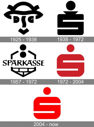
1925 – 1938 (Federal Republic of Germany)
The oldest Sparkasse logo on the list was created in 1925 by Karl Schulpig, a Berlin-based graphic artist. The design was nicknamed Hermes Head. It represented this well-known Greek god. We can see the famous winged helmet, the so-called Petasos, which was one of the symbols of Hermes.
On its official website, Sparkasse lists several reasons for using this symbol:
- Hermes was a patron god for travelers, especially merchants. His symbols were widely used by trading companies and banks, in addition to travel companies.
- It also conveyed the idea of “association,” which was of paramount importance for the brand as it was made up of several companies. In particular, the logo hinted at the merger of Deutschen Sparkassen and Giroverband, hence the abbreviation DSGV, which can be read on the face.
By the time Schulpig was commissioned, he was already famous for winning a logo contest held by the Association of German Commercial Graphics.
1938 – 1972 (FRG)
Here’s when the iconic “S” logo was introduced, which has been with the company over almost all of its history afterward, albeit in a modified form.
The emblem was developed by Lois Gaig, who was known as the designer of brochures, posters, and logos.
The old Sparkasse logo showcased a large “S,” which also formed a moneybox. To make the similarity with the moneybox stronger, the designer added a funnel for coins. It was also supposed to emphasize the significance of saving.
Although the design turned out to be singularly successful, it was not until 1948 that it attained the status of the official trademark (before that, it was only used in print materials).
1957 – 1972 (the German Democratic Republic only)
Over a couple of decades, a different version was used in GDR (German Democratic Republic). It was designed by graphic artist Siegfried Riediger.
According to the company, the updated design could be described as “young, clear, and dynamic” (ironical as it may seem). They also mentioned that while the old logo emphasized the saving process itself, the new one was rather an invitation or motivation to save, no strings (or funnels) attached.
The “saving” theme remained in the form of two coins. There was also part of a brick wall, a symbol of the construction boom that took place in East Germany during these years. The advantage of this emblem was that it included the name of the company, which was seamlessly merged with the picture. However, unlike the “S” logo, the design broke down into multiple parts – there was nothing that held it together.
The honeycomb, which was used as a frame, didn’t save the situation. However, this shape added a new aspect of meaning – it likened the hard work of individuals saving money with the hard graft of bees.
1972 – 2004
The Sparkasse logo was modified by Otl Aicher. As the S-logo already was well-known, he decided to retain it as the basis but introduced a couple of tweaks to make it look more up-to-date.
This is why the funnel was removed. As a result, the logo grew sleeker and more minimalist, which also made it easier to grasp. Also, in contrast to its black-and-white predecessor, this version was given in maroon. This approach helped to add a unique touch.
2004 – present
The Sparkasse logo was slightly tweaked by Jörg Zintzmeyer and Peter G. C. Lux from Interbrand Zintzmeyer & Lux. Their main aim was to make it easier to reproduce using various media.
Colors and font
While the bright red color makes the design eye-catching, it doesn’t look really unique.
Each of the banks within this structure is independent, operated by local CEOs, and works primarily with the residents in its area.


