Montreal Impact is the name of a Canadian football club, which was established in 2010 in Montreal. The club, owned by Joey Saputo, had its first season in MLS in 2012. Montreal Impact has Thierry Henry as the head coach.
Meaning and history
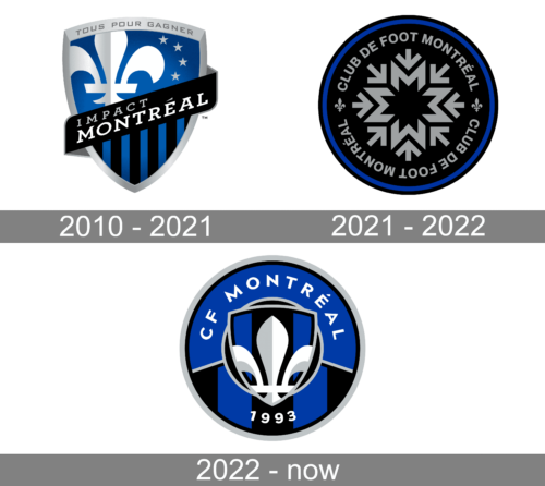
The visual identity of the Canadian football club is classy and chic. Executed in the blue, black, and silver color palette, it looks cold and fresh, pointing on the north re-gion, while the symbols on the crest show its French-Canadian roots.
2010 — 2021
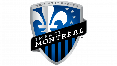
The Montreal Impact logo was designed in 2010 after the club was accepted into Major League Soccer. The sleek crest with a thick silver outline is diagonally divided into two parts. The separating line of the logo is a thick black ribbon with a wordmark on it.
The wordmark in the ribbon is set in two levels, with a silver “Impact” in small capitals placed above the enlarged white “Montreal” in an extended serif font.
Above the nameplate, there is a gradient blue part of the shield with a silver and white fleur-de-lys symbol on the left and three delicate silver stars in the right.
Under the wordmark, there is a vertical striped pattern — with five blue and six black stripes.
The Montreal Impact logo is simple yet has many details, which are very well bal-anced. The blue and black of the color palette represent professionalism and confi-dence, while white and silver shades add lightness, evoking a sense of loyalty and reliability of the club, and showing their value of fans and people believing in them.
2021 — 2022
In 2021, they introduced a black circle with grey elements inside it as a main logo. This grey stuff included a snowflake image right in the middle, as well as the name bits all around it. These said ‘Club de Foot Montreal’ twice – one above, one below. The two were separated by lily images on the sides.
2022 – Today
The new visual identity brought together both previous logos. The designers took the round form of the last logo and added a combination of striped and plain blue for the background. They did not forget to include the white and light gray fleur-de-lys symbol, which was placed inside a shield and set in the center of the emblem. The “CF Montreal” inscription was arching in the upper half of the emblem, while the year 1993 was placed at the very bottom. There was a lot more deep blue in this version and together with the black, they created an image of a confident, stable, and determined team of players.
Montreal Impact Colors
RED
PANTONE: PMS 187 C
HEX COLOR: #AF1E2D;
RGB: (175, 30, 45)
CMYK: (0, 85, 72, 35)
BLUE
PANTONE: PMS 2758 C
HEX COLOR: #192168;
RGB: (25, 33, 104)
CMYK: (100, 69, 0, 62)


