 Southampton Football Club Logo PNG
The club was founded in Southampton, Hampshire, England, in late 1885. Itsoriginal name was St. Mary’s Church, although it was typically referred to as St. Mary’s Y.M.A. (Young Men’s Association) in newspapers.
Meaning and history
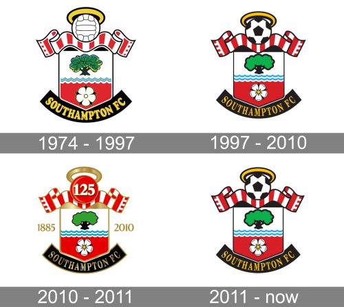
The Southampton Football Club has had only two crests so far. At first, they used the coat of arms of their hometown, while the emblem introduced about half a century ago was designed specifically for the team.
Originally, the players didn’t wear any badge on their shirts. Every time the team needed a logo, it used their town’s coat of arms. It featured a shield with the legendary Hampshire Roses and the lettering “SFC” below.
1974 — 1997
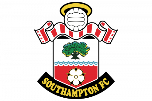
In 1974, the team held a logo design contest. The work of the winner was unveiled in advance of the 1974/75 playing season. Once again, the Southampton FC logo featured a shield shape and the Hampshire Rose, as well as the combination of red and white colors. And yet, now all these components looked different. The shape of the shield frame looked more like a square, the flower acquired a yellow center and a more modern look, while the color palette was enriched by several new colors.
The stylized waves represented the history of the city of Southampton. In the Middle Ages, it became a center of shipbuilding. Southampton was the port from which two legendary ships left for America – the Mayflower (in 1620) and RMS Titanic (in 1912).
The tree symbolized the New Forest. The halo reminded of the fact that the team was established by St. Mary’s Church, as well of its nickname, the Saints. The scarf with red and white stripes reminded of the club’s original emblem.
1997 — 2010
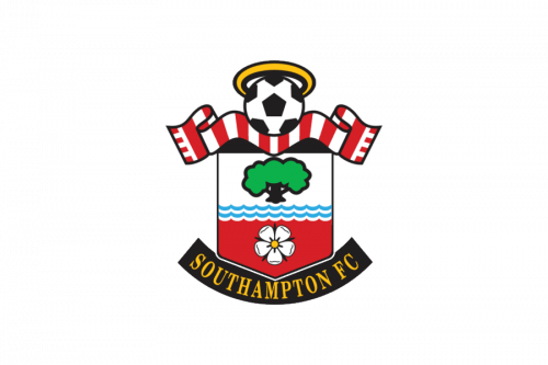
The redesign of 1997 kept all the elements of the iconic Southampton logo in their place, but refined the contours, making them more distinct and elegant. The gold lettering changed its typeface to a sophisticated serif one, with straight lines and sharp angles, the football was now drawn in black and white, with a classic pattern, the flower for its lines bolder and brighter, and the red and white ribbon now looked more like a scarf, with the stripes darker and wider, than on the original version.
2010 — 2011
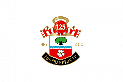
For the 125th anniversary of the legendary club, the new logo was created in 2010. The crest remained almost untouched, just got some gloss and gradients to its elements. The framing on this version was in gold, as well as the serif lettering under the crest, and the newly added to the sides of the badge “1885 — 2010” datemark. The football was replaced by a three-dimensional red sphere with the white shadowed “125” set on it.
2011 — Today
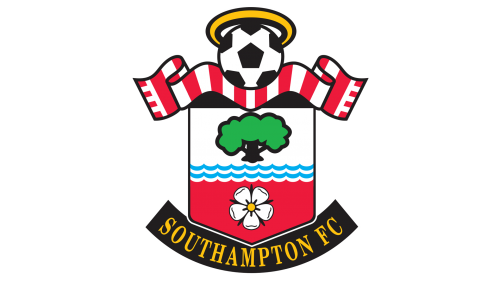
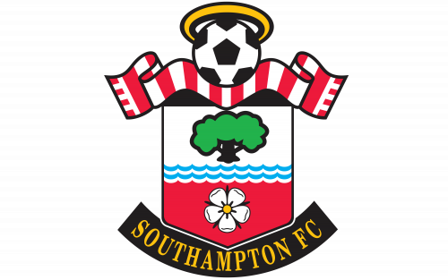
After the anniversary of the football club, the traditional logo was returned as the official one. It was almost exactly the same as the crest, designed in 1997, but with the contours of the letters and images modernized and emboldened. The color palette didn’t change, neither did the composition of the badge. It was a football with a halo, set on top of the crest where the white upper part, featuring a black and green tree image, was separated from the red part with a flower by two blue stylized waves.
Colors
The red and white colors were present on the earliest Southampton logo, while blue, green, gold, black, and yellow were added in 1973.
Southampton Colors
RED
PANTONE: PMS 032 C
HEX COLOR: #D71920;
RGB: (215, 25, 32)
CMYK: (0, 86, 63, 0)
BLACK
PANTONE: PMS BLACK 6 C
HEX COLOR: #130C0E;
RGB: (19, 12, 14)
CMYK: (71, 67, 64, 75)
YELLOW
PANTONE: PMS 7408 C
HTML/HEX COLOR: #FFC20E;
RGB: (255, 194, 14)
CMYK: (0, 29, 100, 0)


