Sonic the Hedgehog is a Japanese video game series. Its creator and owner is Sega. There is also a popular and very diverse media franchise of the same name including multiple spin-off comics and animations. The game got its name after its main character, an anthropomorphized blue hedgehog who struggles against a mad scientist called Doctor Eggman.
Meaning and history
Sonic was introduced in 1991 as Sega’s flagship series and mascot. It was suggested that it would be Sega’s answer to Nintendo’s Mario.
The Sonic the Hedgehog logo has preserved its structure and shape over the years. Yet, there have been several minor modifications.
What is Sonic The Hedgehog?
Sonic The Hedgehog is the name of a famous video game franchise, which was introduced in Japan in 1991. Created by Sega, today Sonic The Hedgehog can be found not only in its games for consoles, but in all possible types of products including toys, printed media, and even fashion items.
1991 – 1999
Japan/Asia Version
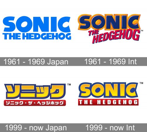
This one shows the basic structure of the logo without loading it with multiple details. You can see the word “Sonic” in huge, bold letters. The most characteristic glyph is the “O,” which appears to have been rotated around 30 degrees clockwise. The “C” also looks very unusual and basically is the same tilted “O” with its right part cut out.
The lettering “The Hedgehog” below comes in an all-caps sans and is by far smaller than the main wordmark.
International Version
Vivid orange trim was added to the word on the top. The calm, austere type used for “The Hedgehog” in the Japanese version, was replaced by a more spectacular font. Even the color, red, added a bright touch.
1999 – now
English Version
The word “Sonic” goes from blue to yellow and adopts a dark blue trim. Due to the gradient, the letters aren’t flat anymore.
The lettering below has grown heavier. It is now white inside a red rectangle.
Japanese Version
While preserving the style of the international logo, the local version features the name of the brand in Japanese. The most notable difference from the international logo, other than the typography, is the shape of the red element below the word “Sonic” – here, the rectangle has rounded ends.
Font
The Sonic the Hedgehog logo pairs two utterly different typefaces. The one used in the first line is more unique due to the rotated “O” and “C,” as well as the creatively cut ends of the “S.” The type featured in the second line is pretty generic – a bold all-caps sans with pronounced variations in the thickness of the strokes.
Colors
Both the international and Japanese versions combine dark blue with red and a noble tint of gold. They make extensive use of the gradient adding much volume. White is used as an additional color.


