PUBG is a shortened name for PlayerUnknown’s Battlegrounds, an online multiplayer game, which was released at the end of March 2017. The game almost immediately took its place in the world’s top sales, after more than a million copies sold in the first sixteen days on Steam, and over 4 million sales already in two months.
Meaning and history
PlayerUnknown’s Battlegrounds is the brainchild of the notorious Brendan Green, who began his career as a moderator of ARMA 3. And the game was named after him, as Brendan’s gaming nickname is PlayerUnknown.
Green created from scratch and implemented his game mode: BATLLE ROYALE. Subsequently, popular game projects such as DAY Z and H1Z1 were released based on this model. Seeing the success, Green decided to create a new game within the STEAM.
The gameplay is fairly simple. 100 players are landed on an island and begin to fight for survival. The initial goal: collect the maximum available resources, which includes weapons, equipment, vehicles. To win, you must remain the sole survivor.
What is PUBG?
PUBG, deciphered as Player Unknown’s Battlegrounds, is an online multiplayer game, which was released in late March 2017, and almost immediately took its place in the top sales (with more than a million copies sold in the first two weeks).
At one point, the distribution of the product was hindered by only one problem — high system requirements for PUBG, which at times managed to slow down even on the top hardware. Bluehole solved the problem in the easiest and most obvious way: launching a light version in the open beta mode, and two versions at once.
PUBG Lite and PUBG Mobile Lite work on almost anything that has any kind of processor, display, and user interface. The model calls to mind Microsoft’s strategy with their stripped-down one-dollar Windows for weak computers, but with one small difference: minus the intentionally degraded picture, the functionality of the Lite-versions of PUBG is almost the same as the standard ones.
As for the visual identity, it remains the same for all of the PUBG versions, having only its bottom line changed, depending on where you play it on.
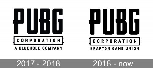
2017 – 2018
The very first official logo for PUBG was introduced in 2017 and featured a strict yet modern and cool monochrome text-based badge, where the lettering was set in three levels, using two styles. The upper level of the logo was taken by a stylized enlarged “PUBG” inscription in a custom sans-serif typeface, where all uppercase letters of the logotype were executed in thick black lines with rounded angles, and slightly elongated tails, which made the narrowed contours of the symbols look more massive and unique.
As for two bottom lines of the logo, they featured a “Corporation” set in capitals of a traditional sans-serif typeface and enclosed into a horizontally stretched rectangular frame with two short lines combing out from both left and right sides, and the lower line with the “A Bluehole Company” tagline, written in the same font as the middle line, but with no additional lines and framings.
2018 – Today
The redesign of 2018 was only about the bottom line of the PUBG logo, though the main inscription was slightly enlarged and cleaned too. As for the “A Bluehole Company” tagline, it was replaced with the “Krafton Game Union”, which is executed in a narrowed and a more square sans-serif, than the one used on the previous version.
The change of the tagline can be explained by the establishing of the Krafton Game Union sun-brand, which was held by the Bluehole in November 2018.
As for the logo we can see on the banners and posters, along with some game icons, it is composed of a stylized “PUBG” lettering enclosed in the same geometric frame, like the one around the “Corporation” on the official corporate logo of the game. Though in the case of the mobile version, the rectangle of the frame is drawn in shocker lines, which sometimes have blurred uneven contours.
Font and color
The PIBG logotype is written in a custom sans-serif typeface with thick confident lines and massive structures of the letters. The font was developed exclusively for the game and has some unique features, such as an elongated to the left and cut from the right horizontal bar of the “B”, or elegantly curved tail of the “G”.
The closest font for the one used for the PUBG logo is, probably, Bricked Bold, Vintage Fonts Collection VFC Fantomen, and Flywheel Condensed Fat, but with most lines modified.
There are several versions of the color palette, used for the PUBG visual identity. Monochrome is the official one, and the logo can be seen both in black on a white background, and in white on a black one. The secondary option for the color scheme consists of dark yellow and white, or gradient orange on black.


