Snap-on Incorporated is a leading global designer, manufacturer, and marketer of tools, equipment, diagnostics, repair information, and systems solutions for professional users. The company’s roots go back to 1920 when it was established in the United States. Snap-on has since grown, extending its market presence through a combination of organic growth, acquisitions, and expansions. With operations in more than 130 countries, Snap-on serves a vast array of customers, from individual vehicle owners to large industrial operators. The core of the company remains its commitment to producing high-quality, innovative products that meet the specific needs of professionals in various industries.
Meaning and history
Snap-on was founded in 1920 by Joseph Johnson and William Seidemann, initially producing ten sockets that would “snap on” to five interchangeable handles. As years went by, Snap-on’s reputation for quality led to its growth and expansion, evolving its offerings to cater to automotive, aviation, and various other industries. Notable achievements include their innovations in tool storage products, diagnostic machinery, and software solutions which have been integral in maintaining the brand’s strong presence in the market. Presently, Snap-on is more than just a tool company. It stands as an iconic brand, recognized worldwide, maintaining its commitment to professionals by providing unique productivity solutions through innovative products and services.
What is Snap-on?
Snap-on is a renowned global company, established in 1920, specializing in the design, manufacture, and marketing of tools and equipment for professional users. With its commitment to innovation and quality, it serves industries ranging from automotive to aviation.
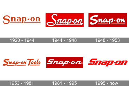
1920 – 1944
The logo is a bold representation of the brand’s name, “Snap-on,” written in thick, orange typography. The typeface is unique with distinctive arches and curves, especially noticeable in the letters ‘S’ and ‘n’. The hyphen connecting “Snap” and “on” adds a touch of elegance, while also emphasizing the brand’s commitment to efficiency and seamlessness. The color orange symbolizes energy, warmth, and enthusiasm, likely representing the brand’s vigor and dedication to quality. Overall, the design exudes confidence and reliability.
1944 – 1948
Set against a striking red background, this rendition of the “Snap-on” logo is both playful and robust. The cursive script adds a touch of flair, echoing handwritten signatures and symbolizing the brand’s personal touch and attention to detail. The white color contrasts sharply with the red, ensuring visibility and recognition. The letters flow smoothly, suggesting ease and accessibility. The logo emanates a sense of trustworthiness, combined with a dash of creativity and innovation.
1948 – 1953
With a minimalist approach, this “Snap-on” logo is sleek and straightforward. Set against a bold red background, the white lettering stands out prominently. The typography is clean and modern, with elongated strokes that emphasize precision and expertise. There’s a sense of stability and trustworthiness in the design, aligning with the brand’s reputation in the industry. The design, in its simplicity, speaks of uncompromised quality and professionalism.
1953 – 1981
This version incorporates the full brand name, “Snap-on Tools”. The orange hue once again highlights the brand’s energy and commitment. The addition of the word “Tools” is rendered in a straightforward typeface beneath “Snap-on”, reinforcing the brand’s specialization and expertise in the tools sector. The typography is bold and clear, making a strong statement about the brand’s legacy and leadership in the industry. This logo encapsulates the brand’s dedication to quality tools and its enduring promise to its customers.
1981 – 1995
Set against a vibrant red rectangle, the “Snap-on” logo is displayed in a modern, white typeface. The text gently arcs, forming a visual bridge between “Snap” and “on.” An embedded registered trademark symbol emphasizes the brand’s official recognition. The juxtaposition of the crisp white letters against the passionate red background captures attention, while also encapsulating the brand’s commitment to standout quality and unmatched excellence. The design exudes an aura of precision, reliability, and contemporary flair.
1995 – Today
Upon first glance, the “Snap-on” logo immediately radiates a vibrant dynamism. Presented in a bold, arresting red hue, the typography employs a distinctive blend of sleek curves and assertive angles, embodying both the fluidity of modern design and the rigidity of tools and machinery. This duality serves as a fitting representation of a brand that is undoubtedly rooted in the world of mechanics and engineering, emphasizing durability, precision, and high-quality performance.
The lettering adopts an elongated design that provides an aura of forward momentum, reminiscent of fast cars on a racetrack or the swift movement of a skilled technician at work. Notably, the interplay between the letters “S” and “n” produces an innovative design, where the former seems to curve and envelop the latter, suggesting protection, cohesion, and unity. Such intricate design choices mirror the brand’s commitment to crafting tools that not only serve a function but also fit seamlessly into the user’s hand, providing a harmonious user experience.
Perhaps one of the most captivating features of this logo is the letter “o” in the word “on”. Resembling a switch or a power button, it subtly hints at the idea of ignition, activation, or setting things in motion. This singular design choice is more than just a visual play; it speaks volumes about the brand’s ethos. “Snap-on” isn’t just about tools; it’s about empowering its users, sparking creativity, and turning potential into palpable action. It’s an invitation, a prompt, urging one to snap on the tool and get to work, illuminating tasks with efficiency and expertise. In essence, the “Snap-on” logo is not merely a name; it’s a call to action, a commitment to excellence, and a testament to the transformative power of tools in the right hands.


