 Sinclair Oil Corporation Logo PNG
Sinclair Oil Corporation was an American gas and oil corporation, established in 1916 and closed in 2022. The company was one of the strongest and largest petroleum players on the global market, but was acquired by HollyFrontier in 2021, and stopped existing as the Sinclair Oil Corporation in 2022.
Meaning and history
Sinclair Oil Corporation was founded by Harry Sinclair in 1916 as the Sinclair Oil and Refining Corporation, as a result of a merger of eleven smaller petroleum businesses. The company was restructured and renamed Sinclair Consolidated Oil Corporation in 1919 and changed to Sinclair Oil Corporation only in 1943.
Sinclair has had a pretty intense ownership history: in the 1960s the company was bought by ARCO, which later became BO, and in the 1970s Sinclair was sold to Robert (Earl) Holding. By the end of the 20th century, Sinclair has become one of the 100 largest private companies in the USA.
The Sinclair Oil Corporation era finished in 2022 and after the acquisition of the company by HollyFrontier in 2021, the corporation got renamed HF Sinclair Corporation.
What is Sinclair Oil Corporation?
Sinclair Oil Corporation is the name of an American company engaged in the petroleum segment and established in the middle of the 1910s. For years Sinclair has been taking the leading positions in the world’s gas and oil industry, but ceased all operations in 2022, after its acquisition by HollyFrontier.
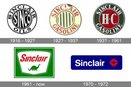
In terms of visual identity, Sinclair Oil Corporation has always been pretty laconic and simple: the company used to have a bold circular badge in different color palettes for decades, and only switched to a hoist orbital banner with a Dino on it at the beginning of the 1960s. Since then the badge has never been changed.
1916 – 192?
The very first logo for Sinclair Oil Corporation was created in 1916 and featured a bold monochrome roundel with the white stylized “Sinco” set in a handwritten font in the center of the logo, and the uppercase “Sinclair Oil” inscription written in black around the perimeter of the medallion.
192? – 193?
The badge was redesigned in the 1920s, getting a new style and color scheme, but keeping the circular shape and the massive lettering around the perimeter. The new logo was set in dark red, and green, with light-crème characters and thin lines of the central drawing with an oil tower. The new badge looked very modern and confident, and has one additional secondary version, with the central element replaced by a vertically striped green and crème roundel, and a light crème framing with red inscription.
193? – 1961
In the 1930s the badge was redesigned again, with the color palette lightened and brightened up, and the central element of the roundel simplified and minimized. Now it was a heavy white “HC” lettering in a fancy serif font with a thick black outline, set against a plain red background and enclosed into a solid green frame with the white “Sinclair Gasoline” lettering.
1961 – Today
The iconic Sinclair Oil badge, which has been in use by the company for decades, was introduced in 1961. It was a bright green rectangular banner with a white horizontally-stretched crest in its center. The crest has its upper corners rounded, and the bottom — clean and straight, the green silhouette of a dinosaur was placed against a white background under the red lantern “Sinclair” lettering in a modern and bold sans-serif typeface with narrowed title case characters.
1970 – 1972
For a couple of years at the beginning of the 1970s, the Sinclair company had been using a secondary badge, set in a navy-blue and red color palette with white sans-serif lettering. It was a horizontally-oriented solid blue rectangular banner, with the inscription followed by a red geometric emblem, looking like a rhombus, formed by four equal elements.
Font and color
The narrowed title case inscription from the primary Sinclair Oil Corporation logo was set in an italicized sans-serif font with heavy lines and clean contours of the characters. The closest fonts to the one, used in this insignia, are, probably, Opinion Pro Extra Condensed Bold Italic, or Manual Medium Compressed Italic, but with the contours of the characters slightly modified, and the dots above the “I”s removed.
As for the color palette of the Sinclair Oil Corporation’s visual identity, it is based on a bright and intense combination of green and red, with an addition of white, which adds lightness and freshness to the badge. Green is the color of growth and development, red represents energy, and white stands for transparency and trustworthiness.


