Shazam is a mobile application, created to identify songs and movies. The app was released in 2002 and today is available for all possible mobile operation systems. Shazam was acquired by Apple in 2018. The application has users all over the world.
Meaning and history
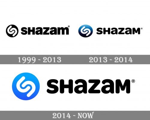
The iconic Shazam emblem was designed in 1999, which the company’s foundation. It wasn’t changed much throughout the years, all the changes were about the brand’s color palette and the typeface of the wordmark.
1999 – 2013
The original Shazam logo was composed of a circular emblem with a wordmark in a bold strict typeface. The emblem depicted two white curved lines, forming the letter “S”, places on a black compact dick background.
The lettering of the wordmark is a combination of capitals with two lowercase “A”s and “M”. The thick lines of the sans-serif typeface and the straight cut of its edges make the inscription look strong and solid.
2013 – 2014
In 2013 the company changes its logo, making it more modern and refined. The Shazam disc turns into a simple circle color in gradient blue, which represents the iconic “loading” sign of the application.
The wordmark was the element, that was changed a lot — its straight extra bold typeface was replaced by a rounded sans-serif with smooth lines. Only two letters remain in the lowercase now — the two “A”s.
2014 – Today
The latest Shazam logo redesign only changed the emblem’s color palette to a solid bright blue. All the other elements remained untouched.
The Shazam logo looks strong and contemporary. It is instantly recognizable all over the globe and looks great on any placement due to its bright colors and smooth shapes.


