Opera is the name of one of the most famous web-browsers, developed in 1995. Today it is available in over 40 languages and has its versions Windows, Android, macOS, and Linux.
Meaning and history
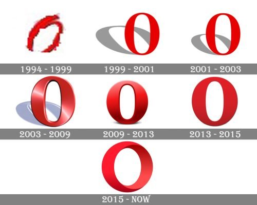
The iconic Opera “O” icon was designed in 1994 and has undergone several modifications throughout the years. The only thing that remained untouched — was a color palette.
What is Opera?
Opera is the name of one of the world’s most popular web browsers, which was developed in the middle of the 1990s by a Norwegian company Opera Software. Today the browser is available in more than 130 languages, and is used by millions of people from all over the world.
1994 – 1999
The Opera logo, used by the browsed in the 1990s, was already executed in a bright red shade, which is still used for the iconic “O” today. It was a bold handwritten “Opera” set in cursive, with the thick lines, resembling the crayon writing. For the icon of the browser the first letter, “O” was placed on a plain white background, with a slightly darker outline of the contours.
1999 – 2001
The original Opera logo depicted a small red letter “O” with a big perspective shadow, drawn in gray. The letter had a thin gray outline in order to create some volume and was delicate and elegant.
2001 – 2003
In 2001 the “O” becomes bigger and the shadow is more proportional now. The letter has no outline and the design of the icon is completely flat.
2003 – 2009
In 2003 Opera creates a three-dimensional logo. The signature red becomes calmer and gains gradient tones. Even the shadow has a 3D shape now.
2009 – 2013
The redesign of 2009 keeps the 3D concept of the Opera logo, but the big “O” shadow is now replaced by a small gray line under the letter. The color palette is back to the Scarlett red, the letter contour is refined and now the logo looks powerful and stylish.
2013 – 2015
In 2013 the logo is being refined again. Not the shadow is almost invisible and the letter “O” became thinner and more delicate and elegant. This version stayed with the browser for only two years.
2015 – Today
The redesign in 2015 brought a completely new “O”, without shadow. The letter has now the shape of the ring, which is perfectly seen due to its three-dimensional execution and half-turned placement.
Font and Color
The minimalistic yet bright Opera logo has no additional lettering near or under its recognizable emblem with the three-dimensional, turned in 3/4, letter “O”, hence there is no official typeface to be defined.
As for the color palette of the Opera visual identity, it uses several shades of red for its 3D badge, which go from smooth and light tone, used for the main part of the character, to the darker shades on its internal area. Red is a color of power and passion, which perfectly represents such qualities as professionalism, stability and progressive approach.


