Shakhtar Donetsk is the name of the most famous and successful football clubs in Ukraine, which was established in 1936 in Donetsk. Today the club, owned by Rinat Akhmetov is the Ukrainian Premier League champion and has Luis Castro as the head coach.
Meaning and history
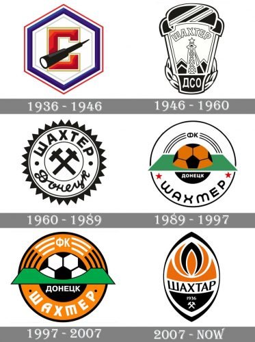
The professional football club from Ukraine has had a very intense history, which was reflected in five name changes, and visual identity redesigns. The team was established under the name Stakhanovets in the 1930s and was renamed to Shakhtyor in 1946. Since that time and until 2007 there were different variations of the Shakhtyor name, with several major logo redesigns. Its current name, Shakhtar, the club got only in 2007.
1936 — 1946
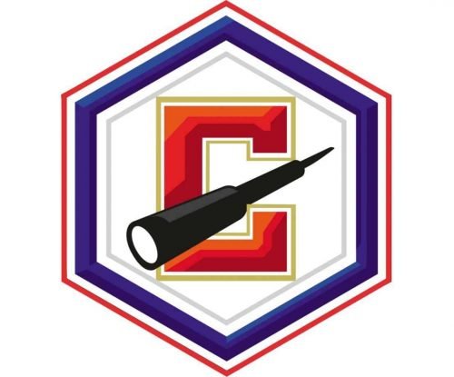
The very first logo for Stakhanovets was created in 1936 and looked pretty simple yet bright. Named after the coal mining company, the club used one of the miner’s instruments in its emblem.
The badge of the club was composed of a white hexagon in a triple red, white and blue outline. In the middle of the badge there was a bold red letter “C” (the first letter of the team’s name in Ukrainian) placed, and over the letter — the black miners’ instrument was drawn slightly diagonally, adding a sense of dynamics and brutality.
1946 — 1960
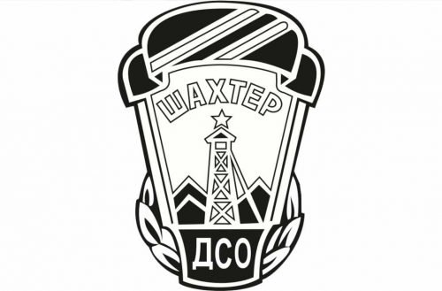
The organization changed its name and the football club followed. Now it was called Shakhtyor, which is Ukrainian for “The Miner”. The emblem was also completely redesigned.
The monochrome elongated crest featured rounded angles and a stylized black helmet on top. In the middle of the crest, the metal tower with the star above it was placed, and the name of the team arched on its upper part. The wordmark was written in Ukrainian and executed in a bold outlines sans-serif.
1969 — 1989
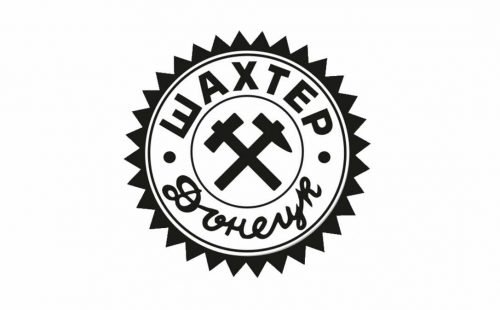
The club changed its name to Shakhtyor Donetsk in 1969, so the badge has to be redrawn again. Now it is a very simple rounded emblem in a black spiky outline. In the smaller circle in the middle of the badge, there was an image of crosses ax and hammer, drawn in a very minimalist manner. The wordmark was written around the emblem’s perimeter, from the inside, and featured two different typefaces — a strict and strong geometric sans-serif for “Shakhtyor” (“Шахтер”) and a custom cursive for “Donetsk” (“Донецк”).
1989 — 1997
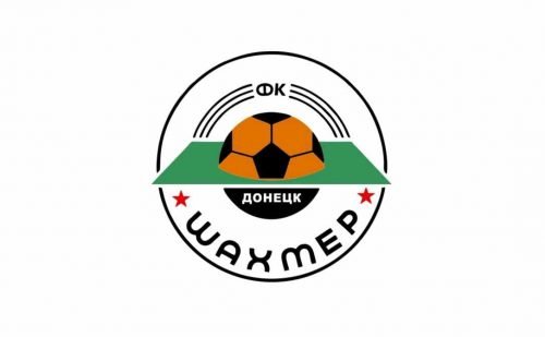
The “FK” part was added to the club’s name in 1989, and the emblem was redesigned again. The new circular badge was mostly white, with a thin black outline. The black and orange football was placed in the center of the composition, being horizontally “cut” by a green parallelogram, symbolizing the football field. Two letters “FK” (“ФК”) were written on the top of the emblem, while the “Shakhtyor” was arched along the bottom side, having two red stars from both left and right.
1997 — 2007
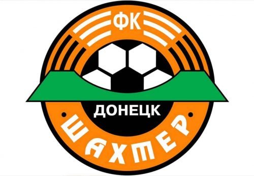
The color palette of the logo was changed in 1997. Now it was an orange badge with all the elements kept unchanged. The only thing redrawn was the wordmark. Now it featured a smoother and bolder sans-serif.
2007 — Today
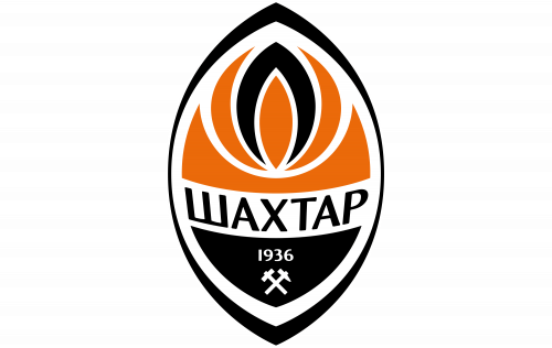
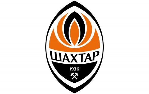
The “Shakhtar” name came to the club in 2007, and the badge was renewed once again. The current emblem is composed of an oval with its upper and bottom parts pointed. The emblem is outlined in white and black and is horizontally divided by the white banner with the black “Shakhtar” lettering. The upper part of the logo featured orange with a stylized flame, while the bottom part is black and has a small white axe and hammer symbol placed under the “1936” mark.
Shakhtar Donetsk Colors
ORANGE
PANTONE: PMS 2026 C
HEX: #F0612C
RGB: (240, 97, 44)
CMYK: (1, 77, 93, 0)
WHITE
HEX: #FFFFFF
RGB: (255, 255, 255)
CMYK: (0, 0, 0, 0)
BLACK
PANTONE: PMS PROCESS BLACK C
HEX: #000000
RGB: (0, 0, 0)
CMYK: (70, 50, 50, 100)


