

![]() Sevilla Logo PNG
Sevilla Logo PNG
Sevilla is the name of one of the oldest and most famous Spanish football clubs, which was established in 1890. Today the club, which won several European championships and has many loud titles, is owned by Rafael Carrion Moreno and has Julen Lopetegui as the head coach.
Meaning and history
![]()
Being one of the oldest football clubs, Sevilla features a very rich visual identity his-tory: there were more than ten major redesigns of the club’s logo. Though the style and color palette hasn’t changed much since the 1920s, the confidence and execution of the iconic badge have made a huge step forward throughout the years:
1908 — 1909
Though the very first badge of Sevilla football club was very naive and amateurish, it still became a base for the iconic badge the whole world knows today. The original logo was composed of two parts, both circular. The first one was a red and white hand-drawn football with vertical stripes and a black “Sevilla Football Club” gothic lettering on it. The second part of the visual identity featured a red “SFC” monogram enclosed in a rounded frame.
1909 — 1915
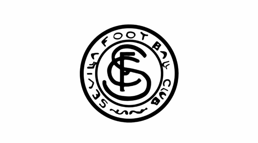
In 1905 the monogram became black and white and the framing was now composed of a double black outline, where the “Sevilla Football Club” inscription was placed around the perimeter. It was a simple yet very recognizable image.
1915 — 1918
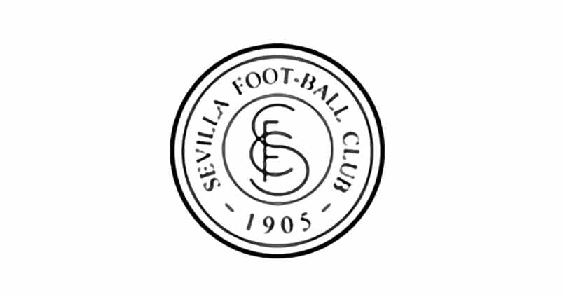
The logo was modified in 1915, keeping the original composition, but executed in a more professional and confident manner, adding the “1905” part to the wordmark around the monogram’s perimeter.
1918 — 1921
The red and white logo from the 1900s came back to the club’s official visual identity, being redrawn in bolder and cleaner lines. The framing and the inscription around it we’re removed.
1921 — 1926
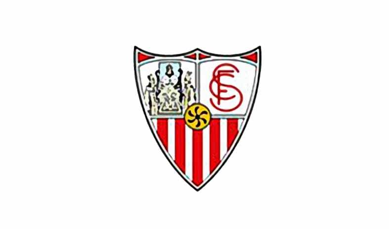
The new ornate shield for Sevilla FC was designed in 1921 and is still used by the club today. The crest, featuring a vertical white and red striped pattern, had two white fragments on its upper part — on the left, there was a colorful image, showing the Trinity, which is the symbol of the Seville City, and in the right, there was a red club’s monogram placed. The yellow circle with an abstract black flower was located in the center of the shield.
1926 — 1932
The color palette was modified, as well as the contours of the whole logo. The black flower on a yellow circle turned into a brown football with black stitches. The Trinity and the monogram have also been redrawn in a more professional way, with stronger lines and contours.
1932 — 1935
In 1932 the football is being modified again, now it looked more realistic. As for the composition itself, it was slightly changed, with the two white segments being smaller now. The main symbols remained the same.
1935 — 1945
More yellow-gold accents were added to the Sevilla crest in 1935. Now the shield started looking lighter and fresher, keeping the iconic elements at their places. Football changed its color scheme from brown and black to yellow and black.
1945 — 1966
In 1945 the upper part of the crest is being colored in red and yellow, making the whole logo look stronger and more professional. The football gained more distinct contours and the monogram looks sleek and contemporary on this version.
1966 — 1979
The crest is being modified again in 1966. All the contours are cleaner and stronger now. Football is slightly enlarged and has more stitches. The monogram gains thinner and more elegant lines, with the letter “S” elongated.
1979 — 1995
In 1979 the color palette of the Trinity part of the crest gains several new shades — burgundy and brown, which makes the image more detailed and interesting. Another change has been done to the iconic monogram, now it looks even more elegant and sophisticated than on the previous versions.
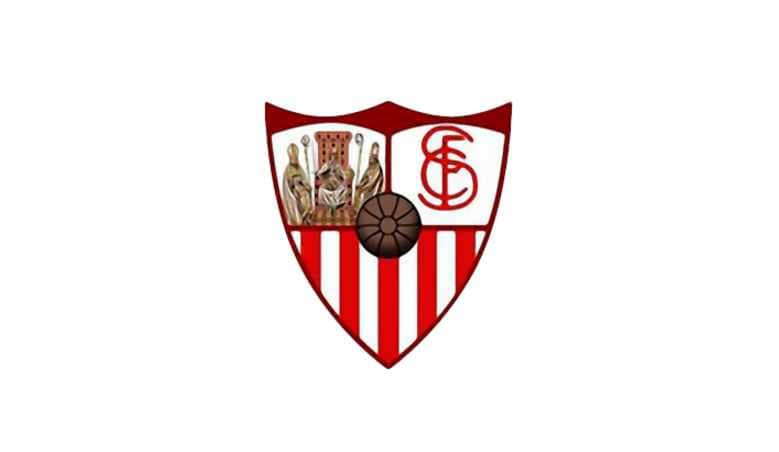
1995 — Today
![]()
The logo we all know today was created in 1995 and remains unchanged for more than 20 years by now. It is still the same iconic crest, but with bolder lines and darker colors. The three-dimensional football is now executed in gradient brown, making the center of the crest vivid. The elegant “SFC” intertwined letters are written in black, showing the club as powerful and professional.
2013
![]()
In 2013 the monogram with fancy letters in calm red started to be used as an addi-tional logo for the team. Enclosed in a circular frame, it is a celebration of the very first Sevilla badge, showing the club’s value of its roots and heritage.
Font and color
The custom elegant monogram, placed in the upper right corner of the iconic Sevilla FC logo, is executed in a unique handwritten typeface with the thin sophisticated lines forming elongated letters with distinct edges. The “S” and “C” of the monogram have their rounded contours extended and sleek, while the strict geometric “F” is narrowed and looks like the axis for two elegant symbols.
The red, gold, and white color palette of the Sevilla FC visual identity is a representation of a strong link to the roots and legacy of the football club, along with its passion and power, willingness to progress and win. White color on the badge stands for transparency, loyalty, and attention of the club to its fans.
Sevilla Colors
WHITE
PANTONE: P 1-1 C
HEX COLOR: #FFFFFF;
RGB: (255,255,255)
CMYK: (0,0,0,0)
RED
PANTONE: WARM RED C
HEX COLOR: #F43333;
RGB: (244, 51, 51)
CMYK: (3, 95, 82, 0)
GOLD
PANTONE: 117 C
HEX COLOR: #C79100;
RGB: (199, 145, 0)
CMYK: (0, 27, 100, 22)


