Seventh Generation is the name of the brand, established in 1988 in the United States, and specialized in the production of ecologically friendly products for home and personal care goods. Today the famous American brand is famous across the globe.
Meaning and history
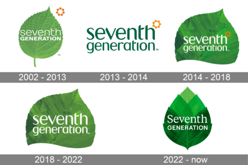
The visual identity of the Seventh Generation brand is bright, memorable, and very meaningful. It is a perfect reflection of the company’s purpose and value of nature and health.
The logo of the brand is composed of a green leaf emblem with white lettering on it. In some cases, the company uses only the wordmark in green, placed on a white background, and for the icon, a single green leaf is used.
The three-dimensional leaf is executed in various shades of green, which makes it look dynamic and very realistic. On the previous logo version, there was a whole leaf on the emblem, but after the redesign, it is only its upper part, which the lower one curvy cut. It is smooth and soft, evoking a sense of trustworthiness and caress.
2002 – 2013
The Seventh Generation logo from 2002 was pretty much the same as the logo, used by the brand in the 2010s. A fresh green leaf with white lettering on it. The gradient green and white color palette looked cool and energetic, representing growth and life. The two levels of the inscription were both executed in a traditional sans-serif typeface, but the upper line boasted thin contours, while the letters of the bottom “Generation” were extended and emboldened”.
2013 – 2014
The redesign of 2013 introduced a new concept of the Seventh Generation logo. It was a two-leveled lowercase inscription in dark green, placed on a white background, with small orange detail, standing for the sun, placed on the upper right corner of the composition. The typeface of the logotype was smooth and elegant, with slightly elongated and curved tails of the lines and arched contours.
2014 – 2018
The logo presented in 2002 was brought back only in a more modern interpretation. The designers used only the top portion of the leaf, cutting the bottom half using a wavy line. The leaf itself was done using a very saturated green color palette with brush strokes going in opposite directions from the center. They placed the previous logo over this green leaf base, switching the color of the inscription to white. The small flower also flaunted a brighter orange.
2018 – 2022
Minor modifications were done in 2018. Most noticeably, the color of the leaf was now more natural and closer to the one seen back in the early 2000s. The company also removed the orange flower and made the lettering slightly larger, which brought more attention to the name rather than the leaf in the background.
2022 – Today
This version looks a lot more like the one presented back in 2002. It also featured a full leaf, although it was not as realistic anymore and was very symmetrical. It appeared as if several leaves were stacked one on top of the other the bottom being much darker and the center being the lightest. As for the name, the designers used a serif version of the font seen in the 2002 logo. The combination of dark and bright greens, sparkly white, and elegant lettering created a sophisticated and luxurious look.


