Land O’Lakes is the name of a food and beverage manufacturing company, which was established in the United States in 1921. Started as a small agricultural cooperative, mostly specialized in dairy products, today Land O’Lakes is a huge structure, consisting of more than seven hundred members.
Meaning and history
Although the main specialization of the agricultural cooperative Land O’Lakes is dairy products, the company also produces animal nutrition and crop protection products.
What is Land O’Lakes?
Land O’Lakes is the name of a large American agricultural cooperative, which was formed by 320 members at the beginning of the 1920s, and by today grown in a huge producer of dairy products, distributed all across the country, and consisting of almost eight hundred members.
Today the brand is famous for its dairy products, especially butter and cheeses. The products with the Land O’Lakes logo on the package can be found on the shelves of almost all the supermarkets across America.
1903 – 1925
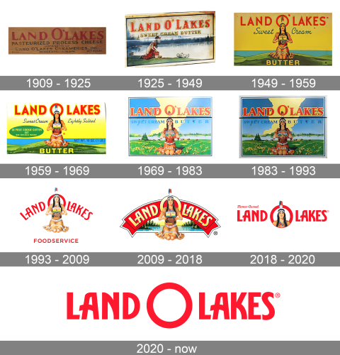
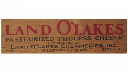
The very first Land O’Lakes badge was very simple and traditional for its time. The logo was based on bold red lettering with a delicate black underline. The upper line contained the name of the brand written in elegant serif capitals, with enough space between the letters, and the “O” enlarged compared to other symbols. Under the red logotype, the additional information about the company and the product was written in black capitals, also in a serif font, but with thinner lines and the letters in a smaller size.
1925 – 1949
The redesign of 1925 made the Land O’Lakes logo more colorful and interesting. Now the red logotype, written in a bold yet narrowed serif font, was outlined in yellow and set on a background with the beautiful lake on it, and a Native American woman sitting at its waters. Under the main inscription, there was an additional line with the name of the product, written in all capitals of a bit different typeface (with the wider and more stable letters”, in thin black bars with a thick yellow outline.
1949 – 1959
In 1949 the Land O’Lakes logo was redrawn again. The background’s colors were intensified, and now it was a bright and powerful composition with the intense yellow fond, blue lake, and a green hill, where the Native American woman was sitting facing front. The logotype was rewritten in a modern sans-serif typeface, with red color remaining. The name of the product was now set on the bottom part of the badge, under the woman’s knees, written in bold yellow sans-serif capitals over the green background.
1959 – 1969
The redesign of 1959 enlarged the logotype and added a bright yellow outline to its letters, while the background became gradient, white on top, going yellow to the bottom. The colors of the lake and the mountain were also intensified, and the Native American woman, sitting with the pack of the branded butter in her hands, got more details and gradients, becoming more voluminous and realistic.
1969 – 1983
In 1969 the Land O’Lakes logo was redrawn again, and this time more tenderly and classically, with lighter and softer colors, and more details of the landscape. The grass was accompanied by small yellow flowers, and the light blue sky above the woman got bright yellow light in the center, right behind her back. As for the lettering, it was rewritten in a bold serif typeface but kept the red color for the letters’ bodies, and yellow — for the outline.
1983 – 1993
In 1983 it was still the same badge, created in 1969, but with the colors brighter and darker. The blue, used for the sky, got a deeper shade, and this made the whole logo more powerful and memorable. The lettering was also refined, with the red serif capitals balanced and stable. The main logotype had a very thin horizontal line under it, separating it from the additional blue lettering, which was also set in the uppercase of a classy serif font.
1993 – 2009
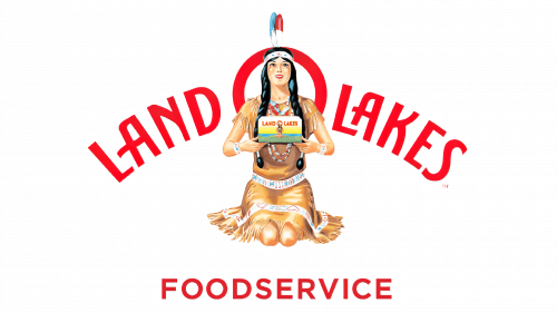
The concept from the fiftieth was rethought by the brand’s designers in 1993. The Native American woman with the butter in her hands was taken from the badge, created in 1949, but placed in the new surroundings this time. It was a plain white background, with two lines of lettering: the upper one was enlarged and arched, with the “O” placed right behind the head of the woman. The “Foodservice” tagline was set in the same color and typeface, along the bottom border of the logo.
2009 – 2018
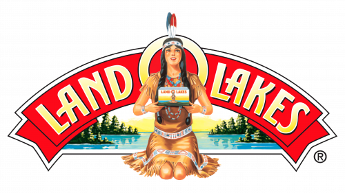
The lake landscape was brought back to the Land O’Lakes badge in 2009. The arched red inscription behind the woman’s back was replaced by a wide red ribbon with a white and black outline. The gradient yellow lettering was arched along with the ribbon, with the “O” significantly enlarged. As for the woman, her contours and colors were also refined, made smoother and more delicate.
2018 – 2020
In 2018 the company decides to simplify the visual identity but is still not ready to abandon the familiar, even iconic, symbols associated with the brand for decades. The new concept is composed of a red logotype set in a straight horizontal line over a white background. Inside the letter “O” there is a portrait of the woman. As for the inscription itself, its uppercase letters are executed in a sleek and stylish custom sans-serif typeface with some of the corners rounded and the horizontal bar of the “A” slightly arched and elongated.
2020 – Today
The redesign of 2020 introduced the most minimalistic Land O’Lakes badge ever created for the brand. It is a bold red logotype set in a straight horizontal line over a plain white background. The inscription is set in the same typeface, like the one from the previous version, but does not have any additional graphics in it, just a simple empty “O”, enlarged and set in the very middle of the composition.


