Seventeen is the name of a South Korean pop band, which was founded in 2015 and consists of thirteen members, all young men. Initially, the band was thought to have 17 members, and the idea was to split the and into three units: hip-hop, vocal, and performance.
Meaning and history
Seventeen is the popular South Korean boys band, which has more members than most of the bands do: SVT is thirteen young men, and each of them has his role in the team. The member of the band was chosen on the tv-show, which lasted for five seasons.
Initially, there had to be seventeen members, but the number was reduced to thirteen, and the band explains their name like 13 members plus 3 units (hip-hop, vocal, performance) plus 1 band equals 17.
The official debut on the music show was on May 27, 2015, on MBC Show Champion. The first mini-album and the music video for the title track were released on May 29th. To date, the group has already released several full-length albums and received a huge number of music awards in both Korea and Japan.
What is Seventeen?
Seventeen, or SVT, is a k-pop band, consisting of 13 members. The boys’ band was founded in 2015, and has a pretty unusual concept: it is divided into three units, which include vocal, hip-hop, and performance.
As for the visual identity, the band is very minimalistic and sharp. Its laconic geometric logo looks progressive and strong, being executed in plain black color, it evokes a sense of movement, energy, and power.
2015
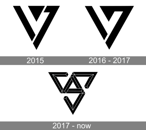
The official Seventeen logo is a bold geometric emblem, drawn in solid black and usually placed on a white background. It is a badge in a triangular shape with the peach pointing down. The main triangle is formed by two segments, which resemble the numbers “1” and “7”. The segments are placed at a slight distance from each other at the bottom and separated by a small solid triangle at the top.
The small triangle is also poring down, and adds sharpness to the whole badge, creating an interesting shape in the negative space of the stylish Seventeen logo.
2016 – 2017

The redesign of 2016 has refined the contours of the Seventeen band, keeping the original idea and style, but merging the triangle with the frame in its right. Without another cut-out the emblem looked more balanced and aggressive, and was still recognizable and associated with the band.
2017 – Today

In 2018 another badge for the Seventeen band was created . The main figure was still a triangle pointing down, but composed of three unfinished triangles coming out of one in the center. The image is now three-dimensional, with thin white lines along bold black bars, adding shape and volume to the image.


