Seinfeld is an iconic sitcom, with 9 seasons tells about the lives of 4 friends in New York – stand-up comedian Jerry Seinfeld (who plays himself), his school friend George Costanza (Jason Alexander), his ex-girlfriend Elaine Benes (Julia Louis-Dreyfus) and troublemaking neighbor Kramer (Michael Richards).
Meaning and history
On July 5, 1989, NBC aired the first episode of Seinfeld, the legendary sitcom that ran for nine years and significantly influenced American television – comedy and beyond. Seinfeld is one of the best-ever sitcoms “about nothing,” as the show’s Creator Larry David articulated it.
The plot tells the story of four buddies – comedian Jerry Seinfeld, his best friend, his ex-girlfriend, and his stairwell neighbor – for nine seasons showing by example that New Yorkers don’t learn from their mistakes.
Seinfeld is quite deservedly Friends’ only real competitor for the title of best TV sitcom of the 1990s. In Seinfeld the jokes are meaner, the characters are sillier, and the writers, on the contrary, sometimes begin to quote Harold Pinter. Plus, there’s not even a hint of sentimentality here. And it’s genuinely funny for the entire ten years.
The Seinfeld series was very popular in the USA, went on for 9 seasons, and the NBC channel that produced it was ready to pay more than 100 million to the main star Jerry Seinfeld for the 10th season, but he categorically refused (joking that since The Beatles broke up after 9 years of creativity, it was time for them to know the honor).
An important characteristic of the series is that it is a comedy of the absurd. The absurdity here is so vital and painfully dark, but at the same time, there is a feeling that we are allowed to peek at a wonderful and playful world. For all 9 years the series had almost no taboo topics, the creators joked about death, sex, and religion, which makes this sitcom actual today too.
What is Seinfeld?
Seinfeld is the name of a super popular American sitcom that was launched in the beginning of the 1990s, and called by the name of the main character, Jerry Seinfeld. This is his real name, under which he gathered full halls being a stand-up comedian. The whole series revolves around him, showing the ordinary life of friends.
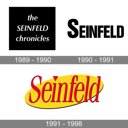
In terms of visual identity, Seinfeld’s sitcom has made a couple of attempts before finding its perfect logo, which stayed with the series for the last seven seasons. The first version was super laconic and strict, while the last one gained intensity and a small decorative accent.
1989 – 1990
The logo, created for the first season of the Seinfeld series, was introduced in 1989 and boasted a black-and-white composition. It was a bold white lettering in a slanted sans-serif typeface, written in three lines against a solid black square. The middle line contained an uppercase “Seinfeld”, while “the chronicles” above and beyond it, were set in the lowercase.
1990 – 1991
For the second second of the series, launched in 1990, the new logo was created. The name of the show was shortened to just “Seinfeld”, and the style of the badge also got more minimalistic. The new concept was built around a bold uppercase wordmark in black sans-serif characters, set against a white background, and with the first letter significantly enlarged.
1991 – 1998
The most iconic logo of the Seinfeld series was created in 1991 and stayed unchanged till the end of the project. The logo was based on a bright combination of colors, red and yellow, with the elegant red lettering in the title case of a narrowed serif font, written across a diagonally stretched yellow oval. The dot above the “I” was replaced by a small red triangle pointing down.
Font and color
The elegant slanted lettering from the primary Seinfeld logo is set in a classy yet slightly narrowed serif typeface, which looks pretty close to such fonts as ITC Fenice Pro Oblique or Proto Serif Italic, but with some small modifications, and the dot above the “I” changed to a triangle.
As for the color palette of the Seinfeld visual identity, it is based on juicy and vivid shades, red and yellow, which transmit positivity, optimism, and endless jokes, which make up the basis of the whole show.


