Scotiabank, which is among Canada’s Big Five banks, has been singularly consistent in its visual brand identity. Having compared its old logos to the current one, you will be surprised how little it has changed. And yet, it has managed to stay in line with current design trends through subtle adjustments.
What is the symbol of the Bank of Nova Scotia?
The symbol of the Bank of Nova Scotia is a bold uppercase stylized letter “S”, which is overlapped by a red and white globe in its central part. The globe here stands for the bank’s international presence, and its numerous branches in dozens of countries across the world, which provide the bank services to people worldwide.
Meaning and history
The history of the organization dates as far back as 1832. It was established in Halifax, Nova Scotia, but moved to Toronto in 1900.
The Scotiabank logo has always reflected its ambition to be “Canada’s most international bank.” The reason behind this nickname is obvious – the company has performed several acquisitions in various parts of the globe, from Latin America and the Caribbean (the majority of acquisitions) to Europe and parts of Asia.
What is Scotiabank
The full name of Scotiabank is Bank of Nova Scotia. It is Canada-based multinational banking and financial services company, which is among the country’s five largest banks. It boasts a client base of almost 25 million people.
1832 – 1961
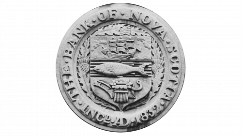
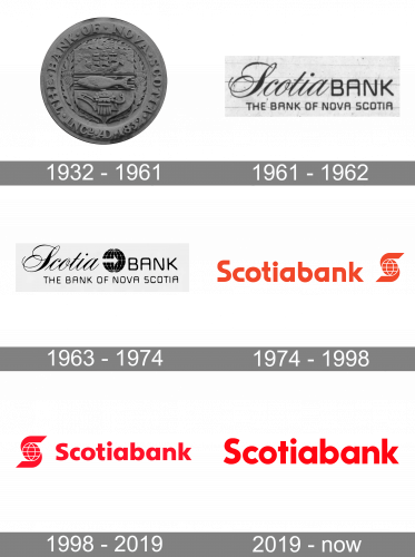
The very first logo of Scotiabank was introduced in 1832 and has stayed with the company for more than a century, which is truly impressive. The badge was executed in a circular shape and based on a heraldic symbol, the crest of Nova Scotia with a horizontally oriented fish drawn in the center. The lettering was placed around the perimeter of the badge in the uppercase of a bold serif font.
1961 – 1962
The redesign of 1961 has completely changed the concept of the Scotiabank visual identity. The new badge had no graphical elements at all and was based on two-leveled lettering in different styles. The “Scotia” was executed in an elegant narrowed cursive font with elongated curved lines, while the “Bank” was set in the uppercase of a modern sans-serif font, and “The Bank of Nova Scotia” tagline used the same sans-serif font, but in a smaller size of the characters.
1963 – 1974
The Scotiabank logo was redesigned again only two years later, in 1963. The previous composition was accompanied by a graphical element, which was put between the two parts of the upper line. It was a solid black globe with thin white lines and a horizontally placed geometric arrow placed across the globe, pointing to the right.
1974 – 1998
The oldest version on the list already echoes the “international” theme – it is represented in a straightforward way by using a stylized globe. The globe is placed inside what appears to be a large “S,” which makes perfect sense as it’s the initial letter of the name of the bank.
To the left of the emblem, the full name of the organization can be seen. The type is an austere sans serif one. Nonetheless, it has a touch of uniqueness, which is especially obvious in the shapes of the “a’s” and “b,” where the drop shape can be noticed.
The color of both the emblem and the wordmark is a rather straightforward shade of red on the white background.
1998 – 2019
The “S” with the globe has moved to the left of the wordmark. The color has grown slightly darker and cooler. The type now looks more traditional. We could have used the word “generic,” but in actual fact being traditional isn’t a disadvantage for the logo of a bank – many financial institutions strive to emphasize their heritage (and, therefore reliability) as their core value. Consequently, the desire to replace a slightly futuristic and unusual type with a more “proper” one appears only natural.
We should also mention the French version of the logo. Here, the wordmark reads “Banque Scotia.” Apart from this, the design is identical.
2019 – present
The redesign of 2019 included several important aspects. First and foremost, the Scotiabank logo now is wordmark-based: the “S” emblem has entirely disappeared from the primary version. It is still used, though, as an independent icon.
The primary logo is set in a sans serif type, which is as unpretentious and classic as the previous one, yet looks slightly different (take, for instance, the “c” and the initial “s”).
The alterations in the emblem, though, are more obvious than those in the wordmark. The globe has lost the meridians and parallels and is now solid. The white spaces between the globe and the parts of the “s” above and below have grown larger. As a result, there is more dynamism now.
We can’t but mention that the globe monogram, in addition to symbolizing the bank’s global ambitions and standing for its initial, also has an additional meaningful aspect. The shapes above and below the globe symbolize two hands. As a result, the meaning of the emblem can be interpreted as “We take care of the world” or “With us, the world is in good hands.”
Also, since 2019, the company has been increasingly using its shortened name “Scotia.”
Colors and font
The vivid red shade featured in the Scotiabank logo is immensely popular in logo design due to its ability to catch your eye, as well as due to its specific psychological effect. The proprietary font used in the wordmark looks reasonably classic without being old-fashioned.


