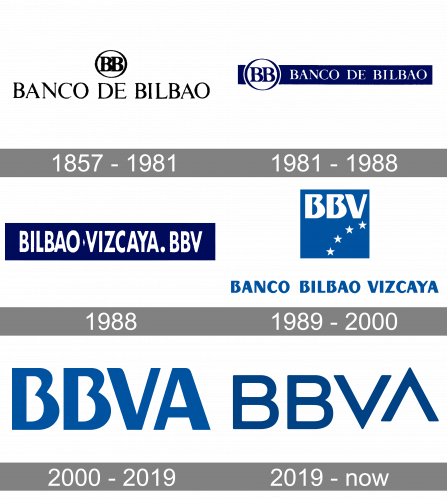
The logo of Banco de Bilbao Vizcaya Argentaria has gone through around five updates during its long history.
Meaning and history
One of the most reputable Spanish banks, BBVA, was established in 1857 as Banco de Bilbao, named after the city of its foundation, Bilbao, Basque Country. As the second predecessor of the modern BBVA, Banco de Vizcaya, it was much younger than Banco de Bilbao and got founded at the beginning of the 20th century.
The merger of the two financial institutions happened in 1988, and the BBV brand appeared in 1989. The “A” in the modern name of the bank came up at the end of the 20th century when BBV merged with Argentaria, another Spanish bank, founded in 1991 by the government of Spain. As a brand name, BBVA was accepted in 2000.
What is BBVA?
BBVA is the name of one of the largest Spanish financial corporations, which was established in 1857 as Banco Bilbao Vizcaya. The abbreviation BBVA stands for the modernized original name of the bank Banco Bilbao Vizcaya Argentaria. Today the company operates not only in Spain but also in Mexico, Portugal, Turkey, Columbia, and several other countries.
1857 – 1981
The company’s roots can be traced as far back as to 1857 when Banco de Bilbao was created. It was an issuing and discount bank.
The majority of the original BBVA logo was occupied by the lettering “Banco de Bilbao” in black. It featured a very refined type. While the serifs were present, they looked artistic, rather like a decorative element than a functional one.
Above the wordmark, an ellipse housing the letters “BB” could be seen. The glyphs were bolder than in the wordmark and were stuck to each other.
1981 – 1988
The ellipse moved down. It now stood to the left of the wordmark. Also, the glyphs inside the ellipse grew larger in comparison with the name of the company. The blue background appeared behind the writing “Banco de Bilbao,” while the filling inside the ellipse remained white.
1988
Banco de Bilbao merged with Banco de Vizcaya. The brand identities also merged, in a way. The new entity adopted the name BBV.
While the logo went through a complete overhaul, it preserved the color scheme of its predecessor: there were white letters inside a dark blue rectangle. Even the shade of blue (rich, purplish) seems to have remained unchanged.
The type, though, now looked more modern – it was a minimalist sans serif (Futura Condensed). The logo read “Bilbao Vizcaya.BBV.”
1989 – 2000
This version was used for only a year before it was updated.
The new design was dominated by a square housing the abbreviation “BBV” in an artistic sans and four stars. Below, you could see the full name of the bank in the same type.
The shade of blue grew lighter. In the old logos, it was the night sky, while the new version was the sky at dawn.
2000 – 2019
The following important event in the bank’s history was the merger with Argentaria. It resulted in another update of the visual brand identity.
The logo grew simpler and more effective. Now, there was nothing but the abbreviation “BBVA” in blue. While the type was inspired by the previous one, there was now a little more air.
2019 – Present
Having preserved the structure of its predecessor, the current logo has introduced utterly different typography. The most distinctive part is the combination “VA.” The “A” has lost its horizontal bar, which made it look like a “V” turned upside down. Now, the logo consists of two pairs of identical letters, “BB” and “VV.”
Also, the designers have moved the letter “A” above the line, which has added some motion (the “A” and “V” are now like arrows pointing in two different directions).
Font and Color
The bold minimalistic lettering from the primary badge of BBVA is set in a clean geometric sans-serif typeface, which looks very modern and sleek. The closest fonts to the one, used in this insignia, are, probably, Heavitas Neue Heavy Bold, or Copperplate Classic Sans, but with significant modifications of the letters “V” and “A”.
As for the color palette of the BBVA visual identity, it is based on a deep and dark shade of blue with calm and confident vibes in it. This hue stands for professionalism and confidence and evokes a sense of stability and safety, showing the customers’ comfort and security as the main values of the financial corporation.
The type featured in the BBVA logo has been drawn specifically for the bank.
Company overview
Banco Bilbao Vizcaya Argentaria, S.A. is a financial services corporation headquartered in Madrid and Bilbao, Spain. It operates primarily in Spain, South America, North America, Turkey, and Romania, although the total number of countries where it is presented is over 30.
Back in 2018, BBVA was Spain’s second-largest financial institution by volume of assets.


