Scandinavian Airlines System, or simply SAS, is a North European airline company, a member of Star Alliance. They provide passenger and cargo transfers across the world. It was formed in 1946 and headquartered in Stockholm. It is the flag carrier of Denmark, Sweden, and Norway. Their hubs are Copenhagen and Oslo Airports, as well as Stockholm Arlanda Airport. With their 180 air ships, they connect Scandinavia with 190+ countries around the world, making traffic of millions of passengers.
Meaning and history
The company was established in 1946 as a solution for growing demand for passenger and cargo transfers. Its founding members were Swedish Intercontinental Airlines, Danish Airlines, and Norwegian Airlines, which merged to handle long flights across Europe and to the United States.
During the 1950s and 1960s, the company explored new routes, such as those across the polar region to Alaska and Canada. They also built airline infrastructure – hotels, operational centers, and other points of presence.
During the leadership of Jan Carlzon in the 1980s, the company secured its consolidation in the Scandinavian region, procuring many smaller airlines in Norway, Sweden, and Denmark, as well as in the outside world.
With the growth of budget and revenue, it became clear that the company needed renovation. In 1997, it created Star Alliance, the world’s largest airline union. It allowed the company to ease the financial pressure on it. In 2012, because of its financial difficulties, SAS launched a cost-cutting operation. It would result in selling its stakes to other companies, salaries decreasing, work time increasing, pension reducing, et cetera. It helped: the company manged to overcome the problems and even formed its new sub subsidiary – Scandinavian Airlines Ireland. Furthermore, it also bought 50 Airbus A320neo airplanes to create a single-type air fleet. In 2021, SAS received a financial aid of US$356 million from European Commission.
What is SAS?
SAS is the acronym from Scandinavian Airlines System – a large air transferring company, which connects Scandinavia with outside world. This is one of the world’s largest airliners, having a fleet of 180+ planes, flying in 191 countries, and transporting millions of passengers and tons of cargo across the world. SAS is one of the four founding members of Star Alliance, the world’s largest airline alliance.
1946 – 1983
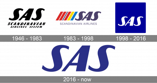
The fist logotype depicts the brand name, written in an uppercase font with italicized script. Above it, they’ve placed the ‘SAS’ acronym.
1983 – 1998
Then, they placed this acronym to the right from 6 lines symbolizing national colors of three Scandinavian countries – Denmark, Sweden, and Norway.
1998 – 2016
In 1998, a year after it participated in Star Alliance establishment, SAS renewed it logotype, adding a new crest and refreshing the nameplate. Now, the familiar acronym was located in a square, and to the right from it, they placed the company’s full name in a single-line inscription. There is also a vertical version of this logo, which depicts the square above the small name caption.
2016 – today
Then, they’ve put just the iconic acronym without any other features.
Color
SAS had only two major renovations in its color palette. The initial logotype was black and white, as it was stylish and easy to use on different backgrounds.
Then, in the 1983 insignia, they added the stripes with national colors of the countries-founders of the company: red, dark blue, yellow, and bright blue. The acronym in this logotype had the blue coloring with a yellow contour.
The 1998 redesign brought us the blue square with the white acronym on it, and the black inscription to the right.
Font
The iconic style of the SAS logotype was also reached by a distinctive font. The acronym has a wavy style of the ‘s’ characters. The letters themselves were bold and italicized.
As for the nameplate, so there were three major changes. The initial logo had a bold italicized script, copying the acronym. The 1983 livery depicted the uppercase name without serifs. It was in cases if there actually was the nameplate itself. In 1998, they introduced a slim inscription with small gaps between the letters.


