SanDisk is an American brand of flash memory devices manufacturer, established in 1988 by Eli Harari and Jack Yuan. In 2016 the company was acquired by Western Digital and today is one of the world’s leading brands in production of flash Malory cards and drivers.
Meaning and history
The SanDisk logo is very recognizable around the world. During the brand’s history, there were just two logos, and the original one was redesigned in 2007. Both versions are memorable and bright.
What is SanDisk?
SanDisk is a corporation founded in 1988 inCalifornia. The company specializes in the development and manufacture of media based on flash memory. To date, the company SanDisk – is the only company that holds patents for the production and further development of memory cards MMC, MS Pro, and RC-MMC.
1988 – 1991
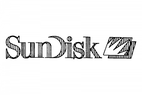
For the first seven years of its history the company, which today is known as SanDisk, was called Sun Disk, so the first two logos of the business were based on this name. The original badge, created in 1988, featured a combination of a geometric emblem and a logotype, executed in a black and white color palette. The emblem boasted a diagonally set rectangle with a triangular pattern, where the left part has thin straight lines, and the second was plain black. The rectangle was shadowed and looked thin and airy. As for the lettering, it was set in the uppercase of a narrowed serif font, in black too.
1991 – 1995
The redesign of 1991 brought the logo design, which was kept by the company until the middle of the 2000s. It was a boldly outlined serif logotype, with the characters featuring a thinly-striped pattern, followed by a shadowed parallelogram, with thin stripes and four triangular rays in white, coming out of the bottom left corner diagonally.
1995 – 2007

The brand was established under the name SunDisk, and was renamed only in the 1990s, so the first emblem is strongly associated with the sun.
The original SanDisk logo was composed of an emblem and a wordmark in sans serif font with some modifications.
The SanDisk emblem was a red parallelogram, throwing a red shadow, with a white flashlight image. The image symbolizes not only the first Sun name of the brand, but also its main product — the memory flash cards. As for the geometric form of the emblem — it resembles of the memory chips.
The original wordmark is a classic typeface of the nameplate with the letter “D” executed as a arched line, symbolizing the Disk or the Sun.
2007 — 2021

In 2007 the company decided to change its visual identity. There was one problem about the original logo, that needed to be solved — it didn’t look good when placed on the small flash cards.
The new logo is just a wordmark, retaining the character of the previous logotype, but in a more elegant and sophisticated way.
The color scheme is the same — bright red on a white background. There is no more emblem on the SanDisk logo today, but the old flash mark heritage is seen in the parallelogram shape of the “i” dot.
The SanDisk logo is strong and powerful, it celebrates the strength and reliability of the brand, showing its confidence.
2024 – Today
Font and color
The redesigned SanDisk logo has the inscription with the name of the company set in a simple modern sans-serif typeface, for the first time in the brand’s history. The lettering featured medium-weight lines and clean shapes, resembling such commercial fonts as YD Yoonche Medium and Rothek Medium.
As for the color palette of the SanDisk visual identity, it is based on a combination of black and white, a timeless duo, which stands for strength, quality, and professionalism. The badge in this palette looks very modern and elegant, adding class to the simple shapes of the elements.


