The 17 athletic teams representing the University of San Francisco compete in 11 sports, including football, baseball, and basketball.
Meaning and history
The athletic identity of the University of San Francisco took shape with the establishment of the San Francisco Dons. This program’s inception is intertwined with the university’s own evolution, tracing back to the early 1900s. The Dons rose to prominence primarily through their men’s basketball team, carving out a niche in the annals of collegiate sports history. In the 1950s, they reached a zenith under the guidance of stars like Bill Russell and K.C. Jones, clinching multiple NCAA basketball championships. These triumphs not only elevated the Dons’ status but also significantly influenced the landscape of college basketball.
Over the years, the Dons have expanded their athletic prowess beyond the hardwood courts. They have made notable strides in soccer, earning national recognition, and have competed fiercely across a spectrum of sports. Today, as members of the West Coast Conference, the Dons continue to embody a spirit of athletic excellence and competitive tenacity. Their journey from a modest athletic program to a symbol of sporting distinction mirrors the evolution of collegiate sports in America, with the Dons maintaining a steadfast commitment to excellence in both performance and sportsmanship.
What is San Francisco Dons?
The San Francisco Dons represent the athletic teams of the University of San Francisco, showcasing a rich tradition in college sports, particularly in basketball and soccer. Embodied by their historic achievements and ongoing commitment to excellence, the Dons epitomize the spirit and competitive nature of university-level athletics.
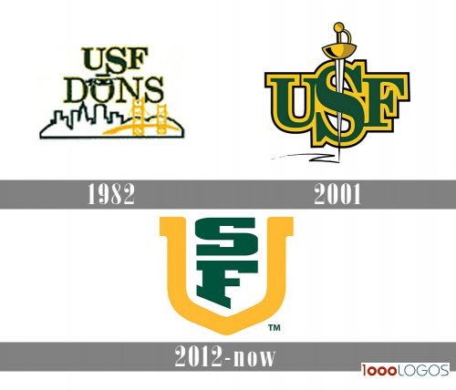
1982
If you want to see a perfect example of a cluttered design, take a look at the San Francisco Dons logo used between 1982 and 2000. The emblem could be divided into two parts. On the top, there was the lettering “USF DONS” given in two lines. The “S” was larger than the other two letters on the line, “U” and “F,” which slightly damaged legibility and looked a bit like a meaningless disproportion. The “O” was wearing a mafia boss mask.
Below, the skyline of San Francisco could be seen, and there was the Golden Gate Bridge on the forefront. The problem was that the abundance of details did not let you grab the image as a whole. Also, the letters overlapped with the picture, which also created the illusion of visual noise.
2001
The following emblem (2001-2011) was by far cleaner. There were the letters “USF” with a saber going through the “S.”
2012 – Today
The current version of the San Francisco Dons logo was adopted in 2012. Here, you can see a large “U” with the letters “S” and “F” inside it. The “U” is golden – the color that has probably been inspired by the Golden State. The other two glyphs are dark green.
San Francisco Dons Colors
USF YELLOW
PANTONE: PMS 1235 C
HEX COLOR: #FDBB30;
RGB: (253,187,48)
CMYK: (0,25,100,0)
USF GREEN
PANTONE: PMS 554 C
HEX COLOR: #00543C;
RGB: (0,84,60)
CMYK: (95,0,80,60)
USF GRAY
PANTONE: PMS COOL GRAY 9
HEX COLOR: #919194;
RGB: (145,145,148)
CMYK: (0,0,0,55)


