While the Safeguard logo has gone through numerous modifications since 1960, there has been some consistency. All the versions have featured a shield (as a symbol of protection) and blue (as a symbol of water and purity).
Meaning and history

Safeguard is a famous French brand that produces antibacterial soaps, produced by Procter & Gamble, a major multinational concern. Safeguard brand soaps feature a unique combination of mild cleansing formula with antibacterial action, which easily and effectively removes bacteria and dirt from the skin.
Consumers first learned about the soap under the Safeguard logo in 1963, that’s when this tool appeared on the shelves of American stores. Over time, Safeguard soap conquered customers in other countries, becoming the number one cleanser, disinfectant.
What is Safeguard?
Safeguard is the largest Global Personal Care P&G brand. It was first launched in the United States in 1963 as a bar soap, and now Safeguard soap is available in other product forms such as liquid hand soap and hand sanitizer. Safeguard is now sold in more than 15 countries in Asia, Europe, Africa and Latin America, with market leadership in China and the Philippines. Procter and Gamble, thanks to its Safeguard brand, was one of the founders of Global Handwashing Day (GHD).
1960
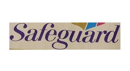
The original logo features a script inspired by handwriting.
1966
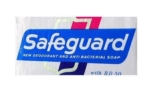
The type grows simpler, although it is still italicized. The word “Safeguard” is white over the blue background.
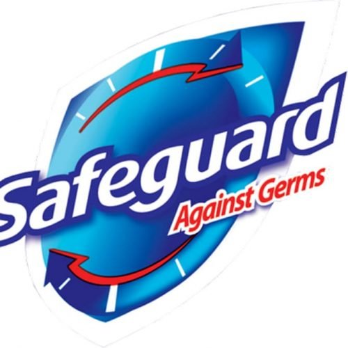
1972
The colors of the shield are slightly modified.
1987
The palette appears somewhat darker.
1994
The blue shape in the background grows smaller.

We should point out that the company used slightly different packages (and logos) in different countries.
2007

The Safeguard logo was redrawn from scratch. The lettering was now positioned diagonally as was the shield.
2011
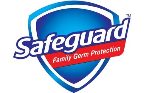
The lettering still goes up, while the shield is positioned straight.
Font and Color
The modern and stable lettering from the primary Safeguard logo is set in an outlines sans-serif typeface with the slightly rounded contours of the title case characters horizontally extended. The closest fonts to the one, used in this insignia, are, probably, eSpectrum Extra Bold Italic, or Aeonis Pro Heavy Italic, with some modifications of the contours.
As for the color palette of the Safeguard visual identity, it is based on bright shades of blue, used in their gradients, white and red. This popular tricolor represent quality, expertise and confidence of the brand in the world’s market.


