 Sacramento State Hornets Logo PNG
Sacramento State Hornets is the name of an athletic program from California State University in Sacramento, a public educational institution, which was established in 1947. The program of the university is composed of 21 men’s and women’s sports teams, which all play in the first division of the National Collegiate Athletic Association.
Meaning and history
The Sacramento State Hornets sports teams play in the first division of the NCAA, as members of two conferences: all teams but three attend the Big Sky Conference, an intercollegiate athletic organization, which was established in 1963, and today is composed of 11 members; the two teams out of the Big Sky area women’s beach volleyball and men’s soccer clubs, which are members of the Western Athletic Conference, and another one is the women’s Rowing team, which is a part of the American Athletic Conference.
What are Sacramento State Hornets?
Sacramento State Hornets is the collegiate athletic program of the California University, Sacramento, which consists of 9 men’s and 11 women’s teams, competing in various sports disciplines, including indoor and outdoor Track and Field, Cross Country, Football, Soccer, Gold and a few others.
As for the visual identity, Sacramento State Hornets athletic program has passed a long way from a funny caricaturish emblem to a modern and sleek abstract symbol on the badge. Although, there is still one thing, connecting all logos, created for the sports teams of the California State University in Sacramento, from the beginning of the 1990s until today — the intense green color.
1991 — 2003
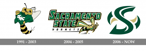
The Sacramento State Hornets logo, designed in 1991, featured a cool drawing of a yellow and black hornet in a solid green sweater with the white “SAC” abbreviation written over its chest. The lettering was set in an extra-heavy modern sans-serif typeface with the letters jumping above the line. The hornet looked very confident and its face was full of irony and self-respect, or something close to it, which was there to show the opponents that they are facing a serious competitor. No additional lettering was present on the badge.
2004 — 2005
The redesign of 2004 introduced a strong contemporary badge in a green gold and white color palette; with the enlarged lettering in three levels, and a stylized image of a hornet, set horizontally on the bottom right part of the logo. The inscription has its upper two levels executed in a fancy custom typeface with sharp triangular serifs at the ends of the lines. Both lines were set in green; with a white and gold outline, which created a good contrast with the solid black background. As for the thin red line of the inscription, it was a black “Hornets”, set in small caps over a white background, using a softer version of the same typeface.
2006 — Today
In 2006 the Hornets logo gets changed again, and the lettering is being completely removed from the composition. Now the Sacramento State Hornets badge features a stylized letter “S” drawn in sharp lines over a white background in green, with some gold and green elements on the sides, creating a kind of a sharp swirl, or a shuriken. The hornet can still be seen on the secondary badge of the athletic program, as the only element there too.


