

![]() Rugrats Logo PNG
Rugrats Logo PNG
Rugrats is a US animated television series for kids. It was made by Arlene Klasky, Gábor Csupó, and Paul Germain.
Meaning and history
![]()
The first episode was broadcasted on August 11, 1991, as the second Nicktoon.
What is Rugrats?
Rugrats is the name of an American animated tv series for kids, which was created in 1991. The series, released by Nickelodeon, has been on the air for nine seasons, with more than 170 episodes seeing the light. Rugrats was created by Arlene Klasky, Gábor Csupo, and Paul Germain.
1990 (before the official release)
![]()
The pilot version of the Rugrats logo might look utterly different from the one that was officially adopted. And yet, despite the different shape, they both shared a playful and laid-back style, which perfectly fitted the contents of the series.
The logo for the pilot version showcased the name of the series written over a teal jagged shape. It looked like the shape had been drawn by a kid. The glyphs also resembled something written by a kid’s hand. Neither of the letters “stood” on the line properly – they jumped either above or below it. The shape of the glyphs was irregular but more or less legible. The writing “rug” resembled a winking and smiling face, which added a friendly touch.
1991
![]()
One of the reasons why the company decided to get a new logo could be that the previous one was not perfectly legible. While it was possible to make out the majority of the letters, there was every chance that you would misread at least one glyph (what about the initial “r,” for instance?).
Similar to its predecessor, the updated Rugrats logo was based on a jagged shape. Yet, this time it was large enough to house all the letters without any exceptions. Also, the designers decided to write the name of the brand in black to make the contrast more tangible.
The alterations in the shape of the glyphs did not affect their joyful mood.
While Nickelodeon modified the palette on specific occasions, the shape remained the same for years.
1992-1996 (Sony Wonder VHS covers)
![]()
The special version looked almost the same as the main logo with the exception of the jagged shape in the background and the fact that the orientation of the lettering was horizontal. The shape was present on the Paramount covers, though.
1999 (merchandise)
![]()
This is a slightly more vivid version. Here, the grayish-violet background shape has been replaced by a white one with a bright yellow border. The designers added delicate shades to make the logo more dimensional without making it too heavy.
The black letters were colored dark purple and slightly changed their shape (it’s a bit more minimalist now, with straighter glyphs). The distinctive colorful “drops” added here and there received subtle highlights and shades making them more dimensional.
Also, the lettering is oriented horizontally.
In addition to being used on the franchise, this version of the Rugrats logo can be seen on the 1999–2005 Paramount VHS/DVD covers.
Font and Color
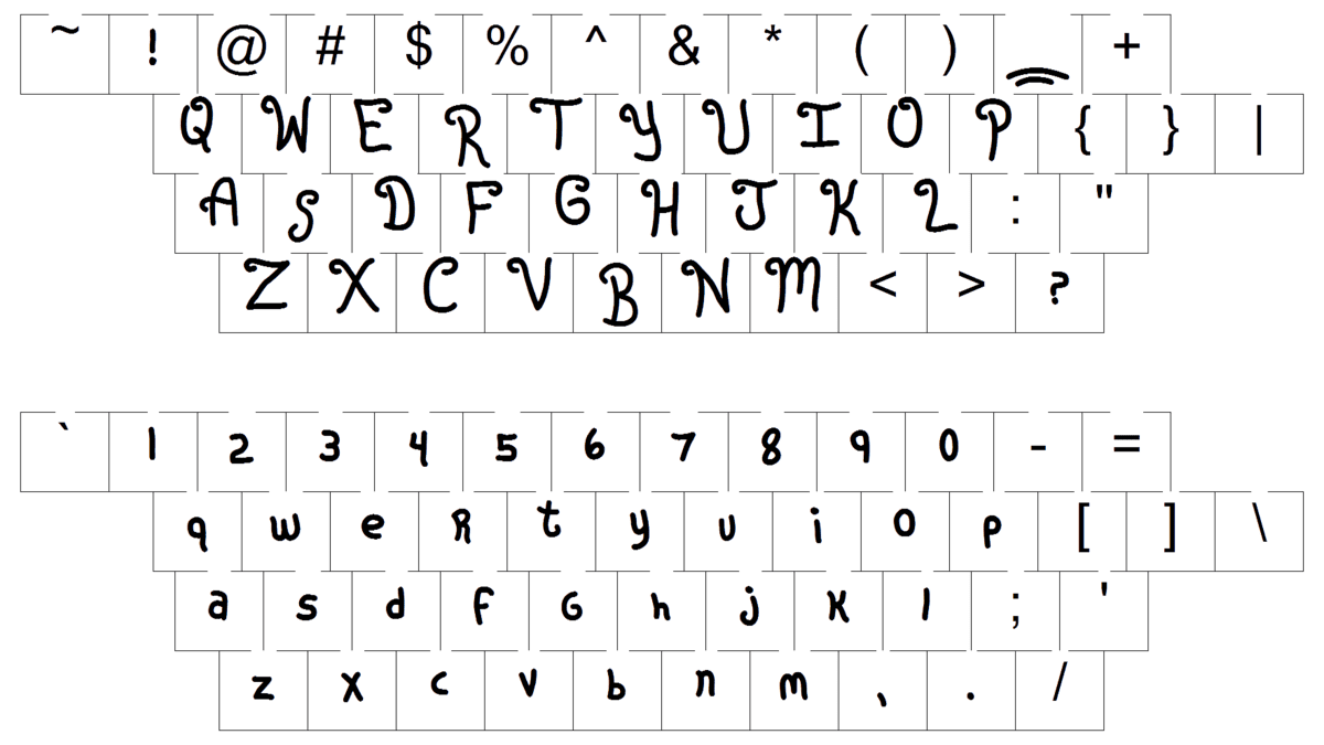 The custom handwritten lettering from the primary Rugrats badge is set in a unique designer typeface with rounded lines of the letters, and smooth and playful contours. The closest fonts to the one, used in this insignia, are, probably, Citronela Display 4, or Orange Gush, but with almost all contours refined and modified.
As for the color palette of the Rugrats’ visual identity, it is bright and intense, based on a combination of purple and yellow, with colorful details, featuring red and green. There is also a lighter shade of yellow in the badge to make it look even more energetic and joyful.


