Rossiya Airlines is a prominent Russian airline known for its extensive domestic and international flight network. It is a subsidiary of Aeroflot and operates as a separate brand. With a diverse fleet of modern aircraft, Rossiya serves various destinations in Russia and abroad, including Europe, Asia, and the Middle East. The airline’s main hubs are located in St. Petersburg and Moscow. Rossiya Airlines focuses on providing reliable and comfortable air travel options for both leisure and business travelers, maintaining high safety standards and delivering quality services.
Meaning and history
Rossiya Airlines is a Russian airline founded in 1932 by the Soviet government as “Pulkovo Aviation Enterprise.” Over the years, the airline has achieved significant milestones, including expanding its fleet and route network, and maintaining a strong safety record. Today, Rossiya Airlines is a subsidiary of Aeroflot and operates a diverse range of domestic and international flights, serving as a key player in Russia’s aviation industry. The airline continues to enhance its services, improve customer experience, and adapt to the evolving needs of travelers, positioning itself as a reliable and reputable carrier in the region.
What is Rossiya?
Rossiya Airlines is a Russian airline based in Saint Petersburg. It is a subsidiary of Aeroflot and operates both domestic and international flights. Rossiya Airlines offers a wide range of services and destinations, serving as a significant player in Russia’s aviation industry.
1934 – 2006
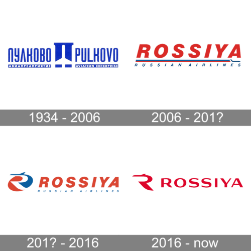
The Rossiya air carrier was established in the 1930s under the name Pulkovo. The first logo of the company has stayed with it for more than seventy years. It was a blue and white badge with the stylized letter “П” in the center: this letter stands for the first letter of the company’s name in Russian. On the sides from the graphical part, there was full lettering with the Russian version on the left, and English — on the right.
2006 – 201?
The redesign of 2006 introduced the first logo with the new name of the air carrier, Rossiya. It was a bold red lettering in the uppercase of a geometric sans-serif typeface, underlined by a tricolor flag and a blue “Russian Airlines” tagline in the same sans-serif font but with smaller characters.
201? – 2016
In the 2010s the logo changed its concept — gaining a graphical element on the left from the bold red wordmark. The emblem featured a red and blue roundel with a bold and elegant letter “R” in white inscribed in it.
2016 – now
The redesign of 2016 has simplified the composition of the Rossiya Logo, redrawing it in plain red. The emblem was minimized to just a part of the stylized “R” in red, drawn against a plain white background, and followed by the red uppercase wordmark in a modern sans-serif typeface.


