Roberto Cavalli is an Italian fashion designer best known for exotic prints and for introducing the sand-blasted look for jeans.
Meaning and history
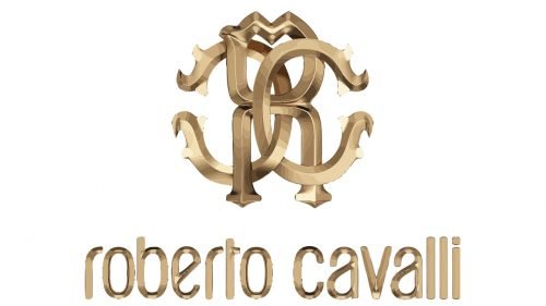
The Roberto Cavalli logo possesses a timeless elegance. The lowercase glyphs are rounded and utilitarian without losing their elegance. The overall style of the wordmark is somewhat similar to the emblems of modern technology companies, for instance the Xerox logo or the Fitbit logo. However, the details of the script are different – you will notice it the moment you take a closer look at the wordmark.
Font and color
The iconic Roberto Cavalli logotype, written in the lowercase of a modern sans-serif typeface with smooth rounded shapes and distinct cuts, looks elegant and friendly, due to the soft shapes and narrowed letters, which evoke a sense of togetherness, yet point to the unique character and individuality of the designer. The custom fashion brand’s typeface is close enough to such fonts as Kandira Alt Bold and Suredog Bold, modern extremely stylish ones.
As for the color palette, the official design is based on black and white, a timeless combination, reflecting elegance and beauty. Though the brand also uses gold shades for its emblem, and even gradient tones, when using its three-dimensional version. Roberto Cavalli is also known for its love of animalistic patterns, so both the emblem and the wordmark can sometimes feature zebra or leopard colors, or can simply be placed on a background in one of these options, being executed in black or white.


