The high street fashion brand River Island is well-known not only in the UK where it is based. Its logo is on more than 350 stores in the UK and in a number of countries of Europe, Asia and the Middle East, so it is recognizable.
Meaning and history
The River Island long history is a vivid example of simplification and shortening, as with each of the three redesigns, the brand has undergone during its history, its logo was getting more and more minimalist, and finally turned into a laconic and stylish badge we all can see today.
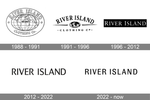
1988 – 1991
The original River Island logo boasted a horizontally oriented oval badge in a double outline, where the wordmark was written around the frame’s perimeter. The lettering featured the name of the brand on top and the “Clothing Co” on the bottom part of the frame. Both parts of the text were executed in an outlines serif typeface, which looked delicate and sophisticated, yet the thickness of the letter-lines added confidence and power to the brand’s characteristics.
The central part of the badge featured a horizontally stretched image of the globe, with all the lines and contours in thin black. The “EST. 1988” datemark was written in the very center.
1991 – 1996
The redesign of 1991 made the globe emblem smaller and placed it under the arched black lettering, executed in a black serif typeface. Two sharp lines were coming from the globe to the sides, and the “Clothing Co” tagline was placed under it, written in the same serif typeface as the main wordmark.
1996 – 2012
In 1991 the logo was redrawn again and this time the emblem was completely removed. Now the logo was composed of a white inscription placed on a black background and executed in a thin elegant serif font with the first letters of both words slightly enlarged.
2012 – 2022
The redesign of 2012 reversed the color palette of the River Island logotype, making the lettering black, and the background — white. The typeface was also simplified and modernized, switching from timeless serif to a strong and confident sans-serif font, which is very close to Excentra Pro Medium and City Boys Sm Bold.
The new River Island logo looks simple yet edgy and stylish, reflecting the purpose of the brand and showing its progressiveness and value of beauty and quality.


