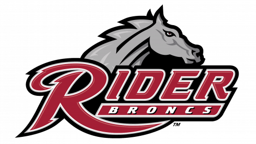
The athletic logo of Rider University in Lawrenceville, New Jersey, was inspired by the name of the program, the Rider Broncs.
Meaning and history
Rider Broncs, the distinguished athletic face of Rider University, was initiated alongside the university’s founding in 1865. This inception marked the beginning of a journey that has woven itself into the fabric of collegiate sports history. A significant milestone in their chronicle was the ascension to NCAA Division I, a leap that heralded a new epoch of heightened competition and broader recognition.
In the realm of achievements, Rider Broncs has carved out a remarkable niche, especially in sports like basketball, wrestling, and baseball. The basketball squad, in particular, has etched its name in the annals of the NCAA Tournament, underlining Rider’s dedication to athletic distinction. The wrestling team, too, has been a cradle for All-American athletes, cementing Rider’s stature in collegiate wrestling circuits.
Today, the Rider Broncs stride forward, maintaining their robust presence in the Metro Atlantic Athletic Conference (MAAC). This era is not just about clinching victories but also about fostering a holistic development of student-athletes. Rider Broncs stand as a beacon of how athletic fervor is harmoniously blended with academic vigor, encapsulating the true essence of a student-athlete’s journey.
What is Rider Broncs?
Rider Broncs, synonymous with Rider University’s athletic endeavors, competes as a proud NCAA Division I contender. Their athletic saga is a tapestry of dedication, competitiveness, and balance. They not only represent the university in various sports but also embody an ethos that interlaces athletic excellence with academic integrity, crafting a unique identity in the collegiate sports landscape.
1977 – 2006
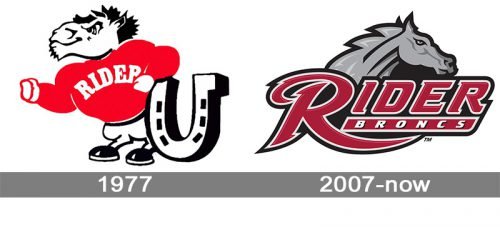
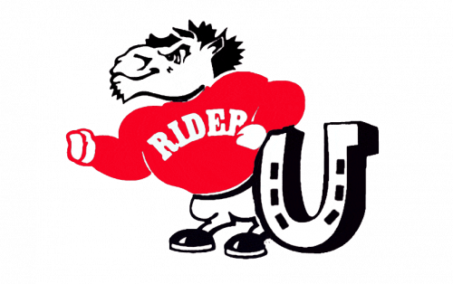
Both the previous Rider Broncs logo and the current one feature a horse. And yet, they look totally different. The creature on the old logo (1977-2006) is cartoonish and oversimplified. Although the horse has a fierce expression on its muzzle, you can hardly take its serious.
2007 – Today
The 2007 logo looks more professional. The horse’s head bears a determined expression, and there is a lot of dynamism in the logo. The typography used for the lettering “Rider Broncs” (specifically, the extended end of the “R”) adds some motion, too.
Rider Broncs Colors
RIDER CRANBERRY
PANTONE: PMS 201 C
HEX COLOR: #981E32;
RGB: (152, 30, 50)
CMYK: (7, 100, 68, 32)
RIDER GREY
PANTONE: PMS 424 C
HEX COLOR: #6C6F70;
RGB: (108, 111, 112)
CMYK: (30, 20, 19, 58)
WHITE
PANTONE: P 1-1 C
HEX COLOR: #FFFFFF;
RGB: (255, 255, 255)
CMYK: (0, 0, 0, 0)


