Ricoh is an award-winning Japanese brand of digital cameras and office electronics manufacturer, founded in 1936. Today it is an international company, operating in 25 countries and selling its products all over the globe.
Meaning and history
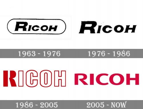
Though the company was established in 1936, its first logo was introduced only in 1963, and it was a simple badge, which grew with the brand and turned into a solid and bright logotype, which looks professional and strong today.
1963 – 1976
The original Ricoh logo, created in 1963, featured a bold italicized inscription in all capitals of an elegant serif typeface. The logotype was enclosed into a horizontally oval frame and looked massive and bright due to the thickness of the letter lines. Though the slightly visible sharp serifs softened the brutal look and added a touch of elegance and style to the logo.
1976 – 1986
The redesign of 1976 only cleaned the contours of the inscription, slightly enlarging the serifs, and removed a frame, putting the black wordmark directly onto a white background.
1986 – 2005
The monochrome palette was replaced by red and white in 1986. A stylish and modern wordmark, set in a bold and laconic sans-serif has its white letters outlined in red, and the first “R” stylized and drawn in solid red. The contour of its upper part was open, which added uniqueness and progressiveness to the logo, making it evoke a sense of lightness and dynamics. The “R” was also used as the brand’s icon, being enlarged and placed above the lettering, it looked cool and powerful. This logo stayed with the brand for almost twenty years.
2005 – Today
In 2005 the logo was redesigned again, and now the Ricoh visual identity featured a bold red logotype, which is sometimes complemented by a delicate black “Imagine. change.” tagline in the lowercase. The smooth and modern sans-serif lettering in all capitals looks minimalist yet its red color adds a sense of passion, power, and professionalism, showing the company as a strong and confident one.


