REWE is the name of a European food retailer, which was established in 1927 in Germany. Today it is one of the country’s largest companies in its segment, which has over 3 thousand stores.
Meaning and history
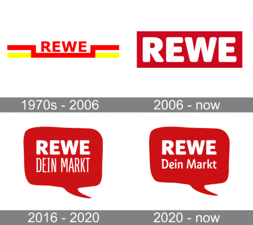
The popular German food store chain boasts a visual identity, which points in its history. The solid and brutal shapes, embedded in a bright yet simple color palette — representation of strength, confidence, and stability, very German.
1970s – 2006
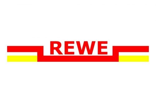
The original Rewe logo was composed of a red wordmark in all capitals, executed in an extra-bold sans-serif typeface, and very well balanced in terms of space. The inscription was underlined with a thick red line, which had its “wings” going up under the right angle, and two yellow horizontals, coming out of it.
The red, yellow, and white color palette of the Rewe logo was a reflection of power, energy, and passion, along with the loyalty and reliability of the company.
2006 – Today
In 2006 the logo was redrawn and simplified. Today the bold white capitals letters are placed on a scarlet red background, with no extra details and framing. The massive letters have their thick lines clean and their angles soft and slightly rounded, which makes the whole inscription friendly and welcoming.
The typeface of the Rewe visual identity looks very similar to Segaon Soft Black, which is a bold modern sans-serif with solid shapes and a lot of confidence in it.
2016 – 2020
Rewe was not the only supermarket to add words such as “My” or “Your” to their name. The new logo had a lot in common with the previous version thanks to the use of the same color palette and even the same font for the “Rewe” portion of the inscription. Right underneath, they added “Your Market” in German using a finer typeface. The rectangular base was replaced by a speech bubble with rounded angles.
2020 – Today
The updated version looked almost identical to the previous one. The designers have changed the shape of the base a bit and used a different font for the second line. Here, it had only the first letter capitalized and featured slightly thicker lines. Although the letters go smaller, it was easier to read.


