Real Sociedad is the name of a professional soccer club from the Basque Country, located in the town of San Sebastian. The history of the FC begins in 1904, when the health club San Sebastian was founded, which even participated in the Spanish Cup. And in 1909 the Club Ciclista de San Sebastian managed to reach the final of the National Cup, so September 7, 1909, is the official date of the club’s foundation.
Meaning and history
Real Sociedad came under the patronage of Alfonso XIII thanks to the fact that San Sebastian was the summer capital of Spain. And of course, the generous king granted the team a “Royal” prefix real fast.
The Basque club is not among the most titled clubs in Spain, but it is stable and has certain trophies in its collection. The team achieved the greatest success in the 1980s when it became the champion twice and won the Cup and the Super Cup of Spain. But on the international stage achievements of the Basques are very modest.
During more than 110 years of history, Real Sociedad has twice won the Spanish championship and did it twice in a row (in the seasons 1980-81 and 1981-82). Another three times the team won the silver medal of the national championship
What is Real Sociedad?
Real Sociedad is a Spanish football club from San Sebastián, established in 1909. The team plays home matches at the stadium Anoeta, the club colors are white and blue. Real Sociedad was one of the founders of the Spanish La Liga (1929). In the club’s history, it has twice won the national championship and three times — the Spanish Cup.
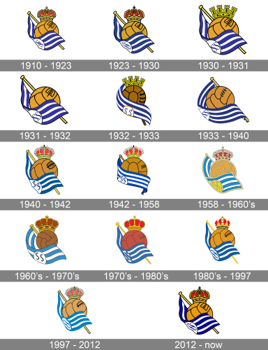
Despite more than a dozen of logo redesigns, held during the long history of the football club from San Sebastián, the design, which all of the Real Sociedad badges are based on, was introduced in 1910, on the initial badge of the club. Since that time the logo has only been refined, getting the contours and colors cleaned and intensified.
1910 – 1923
Being a tram from San Sebastián, the favorite city of King Alonso XIII, the Sociedad Football club didn’t have to wait long for being granted the “Royal” Status. So it’s the very first badge, designed in 1910, has already had a crown on it — the symbol of the King’s patronage. The badge of the club featured a composition with a light brown football ball, and a striped blue and white flag waving around it, with the flagpole placed behind the ball. The crown was set on its top, and the flag was decorated by a blue “SS” monogram, which stood for “San Sebastian”.
1923 – 1930
The redesign of 1923 made the shades on the Royal Sociedad logo darker and calmer. Another change was made to the monogram on the gray: in the original version, the setters were intertwined, while now there were set in one line with a slight space in between. Everything else remained almost untouched, apart from the little cross on top of the crown, which was golden, and turned black.
1930 – 1931
In 1930 the crown on the ball started resembling a yellow castle wall with four towers, the same symbol could be seen on the Second Spanish Republic coat of arms, so again the club showed its patriotism and value of its roots in their visual identity. The blue and white flag was enlarged, and its flagpole, which was now drawn in a very light and bright shade of yellow, too.
1931 – 1932
Because of the tough political situation in the 1930s in Spain; the crown symbol had to be removed from the Royal Sociedad logo, as all the Royal symbols became illegal after King Alfonso got overthrown. The team even had to change its name to Donostia Football Club to avoid any affiliations with the Royal court of Spain.
1932 – 1933
The flag was placed diagonally and had its stripes thinner on the new version of the logo, introduced in 1932. The crown was back to the badge, but it was not the Royal crown, it was the four-tower crown, just like the one on the logo, created two years earlier. The white circle, which had a blue monogram written on it, gained a thicker gold outline, which made it look more intense and bright.
1933 – 1940
And again, the logo without any crown was used by the club from 1933 till 1940. The brown ball was still there, and the blue and white flag was redrawn, having its stripes thin and sleek. The golden outline of the white circle with the monogram was barely seen.
1940 – 1942
In 1940 the Royal symbols were allowed to be used again, and the club comes back to its name and the red and gold crown on its badge. The flag was shortened and the shade of blue gone calmer. Also, the white circle with the monogram was now taking more space on the flag than ever before.
1942 – 1958
The redesign of 1942 hasn’t shown anything new: it was still the same composition, with the leather Football ball, a blue and white flag, embracing it, and a red and gold crown on top. The crown of this version was very delicate and small compared to previous badges, the flag also looked narrower, making the ball the most important part of the logo.
1958 – The 1960s
All elements of the Royal Sociedad logo were refined and got their colors to lighten up, at the same time, everything now got a thick smooth outline in a tender cream shade. The crown, the segments of the leather ball, and the perimeter of the flag, everything was outlined in this new shade, which softened the badge and made it look sleek and elegant.
The 1960s – The 1970s
In the 1960s the ball got smaller and gained a darker shade of brown when the flag with three light blue striped and two white ones was enlarged and had the white circle with the black handwritten “SS” monogram more visible now. As for the crown, it was larger than ever before, but due to the absence of the colorful gems on it, and to the new dark color palette, it didn’t not loo “too much”.
The 1970s – The 1980s
Some red shades were added to the ball and crown at the beginning of the 1970s. The flag got more stripes, which were thinner and darker than the ones from the previous version. The “SS” monogram turned blue too, with the narrowed letters in a bold serif typeface. It was a bright badge, which stayed with the club for less than ten years.
The 1980s – 1997
The version, introduced in the 1980s featured a smaller crown, but some decorations were added to it. As for the ball, it got lighter, and the stitches — on the contrary, darker and bolder. The flagpole, set diagonally above the ball, was colored in light yellow and had the outline removed.
1997 – 2012
The redesign of 1997 introduced a new style of the crown and a light muted color palette of the badge, which looked calm and soft. The stripes on the flag got brighter and evokes a sense of freshness, freedom, and lightness, while the brown ball got yellow shades, standing for energy and motion.
2012 – Today
The logo, resembling the one, designed in 1923, became primary for the Royal Sociedad football club in 2012. The only difference between this version and the original one is in the dark and bright color palette, with all shades intended to the maximum. The new palette represents the power and energy of the club.


