

![]() Raytheon Logo PNG
Raytheon Logo PNG
Raytheon is the name of the weapon manufacturer, which was established in 1922 in the United States and ceased all operations in 2020. The company was known to be one of the largest providers of arms and electronics to the US military, but it also produces some consumer products and sensors for space and aeronautic industries.
Meaning and history
![]()
The visual identity of the American firearms producer has always been minimalist yet strong. Its text-based logo was redesigned only twice before the company changed its name and direction in 2020. It was also pretty consistent with the color palette — the monochrome one was used for almost 40 years, and then got replaced with red and white, the second most powerful color combination.
1946 – 1960
![]()
The logo, designed for Raytheon in 1946, was composed of a horizontally placed black oval in a double black and white outline. The white “Raytheon” inscription in bold capitals was placed inside the oval and featured a traditional clean sans-serif font. Though all the letters of the wordmark were capitalized, they “grew” to the middle from both sides, so “T” and “H” formed some kind of an arrow, pointing up.
It was a strict emblem, evoking a sense of power and progress, a perfect choice for the company’s segment and purpose.
1960 – 1984
![]()
In 1960 the logo was simplified and colors on the emblem were switched. Now the black lettering was placed inside a white horizontal oval, which was enclosed into a black rectangle.
The lines became cleaner and the typeface — more laconic. The logo from the 1960s looked more professional and reflected the expertise and authority of the brand.
1984 – 2020
![]()
The last logo for Raytheon company was created in 1984 and stayed until 2020 when the company got renamed. Everything but the wordmark was removed. Yet the brand changed its constant monochrome palette to red on white, so the logo hasn’t become boring or modest.
The inscription in a title case was executed in an ExtraBold sans-serif typeface, which is very similar to Proceed Ultra Black font, but with the letter “T” slightly modified.
The thickness of the letter lines and the intense red color represented passion, strength, and progressive approach of the company, making people see its authority and professionalism.
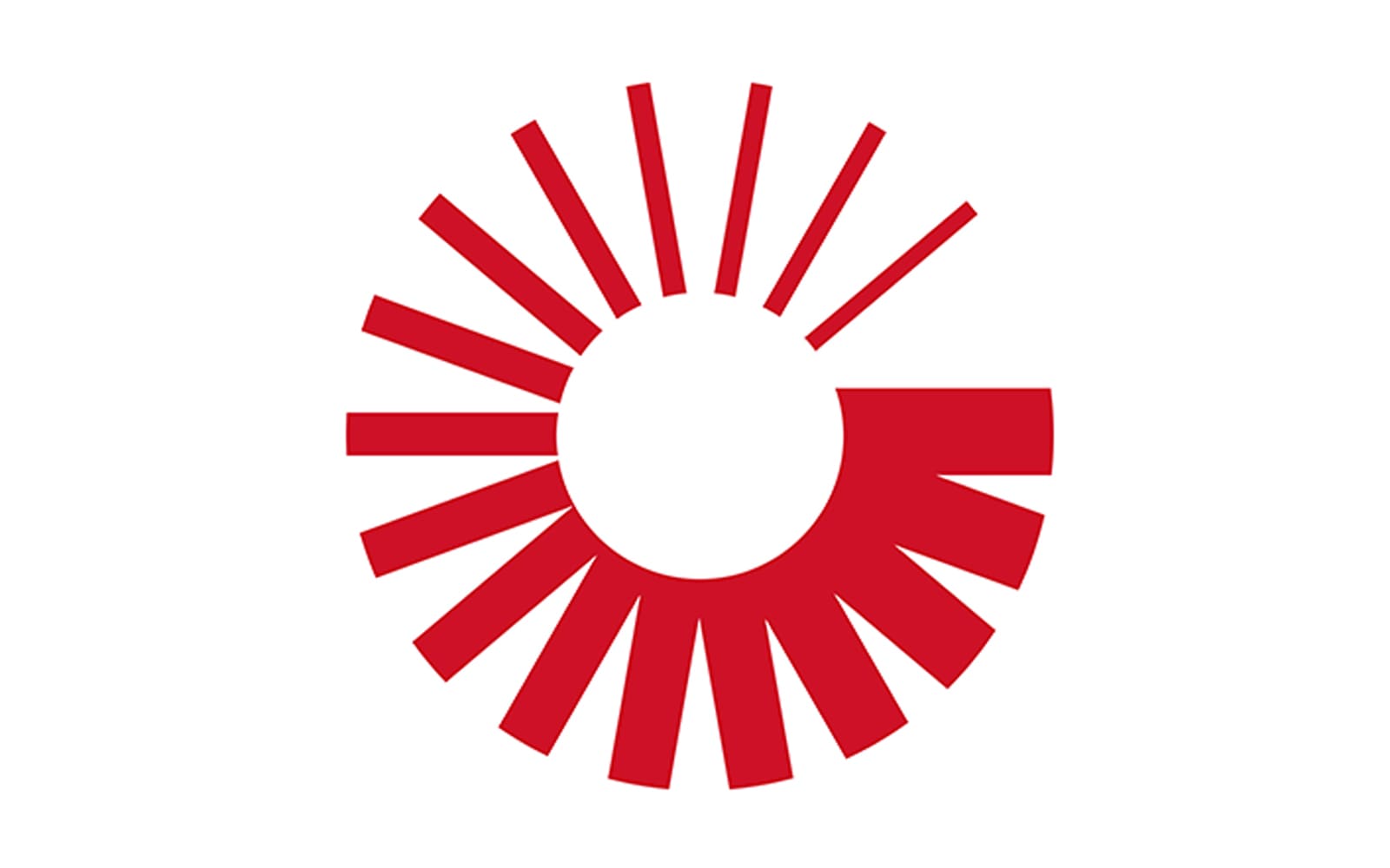
2020 – Today
![]()
In 2020 Raytheon became Raytheon Technologies, after merging with United Technologies Corporation. And the logo we all can see today is a result of this merge.
The visual identity of the new company is composed of a wordmark, set in two levels, and an emblem on its left. The upper level of the wordmark contains “Raytheon” lettering in bold sans-serif when the bottom “Technologies” feature a lighter typeface with thinner lines.
As for the emblem; it is a red circle, composed of red lines of different thicknesses. They are coming out from a smaller white circle, like rays from the sun.


