Raid is a line of insecticide products made and marketed by Wisconsin-based private company S. C. Johnson & Son. Originally, the products were based on allethrin, while the current line combines products with various active ingredients depending on its purpose.
Meaning and history
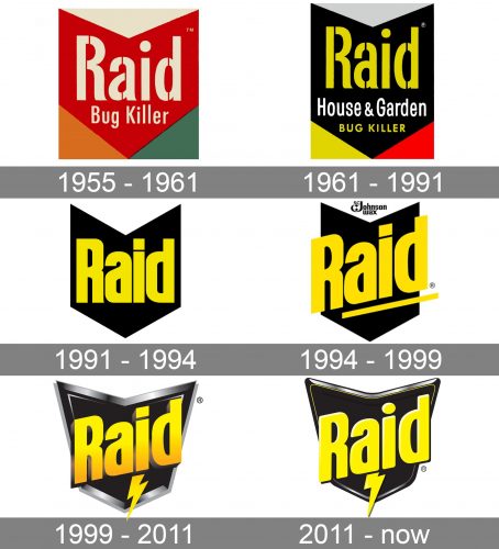
In spite of the brand’s long history, the structure of the Raid logo has remained pretty much the same over time. Even the black and yellow color scheme has been used for most of the brand’s history. This doesn’t mean, though, that the visual brand identity has been unchanged.
What is Raid
Raid is one of the most popular insecticides. Together with its main competitor, Black Flag, the brand dominates the insecticide market. It has a very popular slogan “Raid Kills Bugs Dead,” which is supposed to be invented by the poet Lew Welch.
1955 – 1961
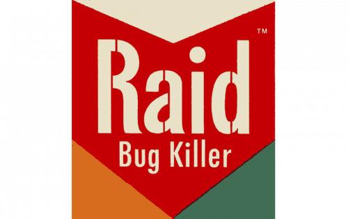
When the insecticide was launched in 1955-1956, it already used a logo based on the arrowhead shape. The arrow was thick and red. It was directed downward.
It was placed in a rectangle box. As a result, three triangles were left, one of them above and two below. Each was colored in a different color: white (top), orange (on the lower left-hand side), and green (on the lower right-hand side).
The lettering “Raid” was written across the arrowhead in white. The type was a rather simple sans, which had a unique touch due to gaps in various unexpected parts of the letters. The wordmark was paired with the explanatory tagline “Bug Killer.” It was also white but featured smaller letters.
1961 – 1991
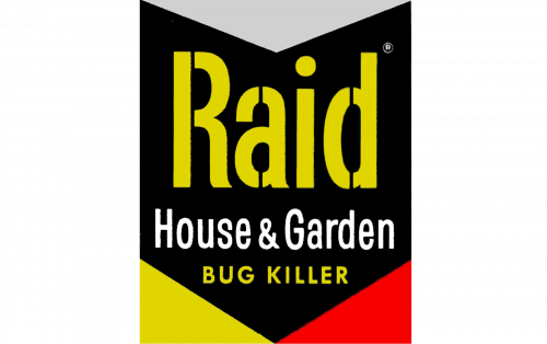
This is when the aggressive and eye-catching combination of yellow and black was adopted, which has been associated with the Raid logo ever since.
The shapes of the elements were slightly altered, too. The thickness of the arrowhead became the same at the center and on the sides, whereas in the previous version, the sides were thinner.
The designers behind the logo redrew the wordmark without sacrificing its overall style and leaving the recognizable gaps where they had been. In addition to the lettering “Bug Killer,” which was now yellow and capitalized, the words “House & Garden” in white were added. On the one hand, they made the design more cluttered. On the other, it helped to explain how the product could be used, and thus potentially widened its target audience.
1991 – 1994
The updated version is more powerful and uncompromising. It seems to better fit the brand’s promise.
The effect partly results from the solid, heavier type. It doesn’t have any gaps now. The simpler design, without the colored triangles on the sides, also contributes to the overall impression.
1994 – 1999
The design got a dynamic touch. It resulted from the fact that the letters were slightly rotated counterclockwise. They now were directed upward. Also, a yellow line appeared under the wordmark, which contributed to the impression of implied motion. The sides of the arrowhead were cut off, so now the wordmark was slightly larger than the black shape in the background.
1999 – 2011
Over the ensuing decade, the brand used a logo with a tangible 3D touch. The arrowhead eventually looked like a shield now, which probably had always been the designers’ intention. A lightning bolt appeared.
2011 – present
The update was very subtle and included only minor details. For instance, the rectangle above the “i” was replaced by the dot, while the letters lost the gradient.
Colors and font
The combination of bright yellow with black cries: “Caution!” We subliminally associate the colors of wasps with danger. So, it’s been only natural to use this scheme for a product that is intended as a lethal weapon. The heavy type looks powerful.


