R.O.C.S. is a brand of a Russian toothpaste manufacturing company, which was established in 2004. The brand became very popular in the local market due to the high quality of its products and began expanding abroad. Today R.O.C.S. toothpaste is being sold in over 50 European and Asian countries.
Meaning and history
The R.O.C.S. visual identity is modern and creative. The brand’s logo is instantly recognizable and eye-catching, which makes the products stand out on the shelf.
The dental care brand’s logo is composed of a graphical logotype, which uses different patterns, depending on the product line.
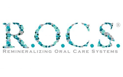
The wordmark in all capitals is executed in a bold hand-drawn serif typeface, where all the letters are strong and solid, reflecting the company’s professionalism and expertise. The most outstanding part of the logo is the texture and design of its nameplate’s letters. Each letter is formed by many small pieces, which resemble little stones or molecules and have different color palettes in different brand’s categories.
The color palette of the R.O.C.S. visual identity varies from package to package — it can be white on purple or blue on white, as well as light blue with sparkles placed on a black background. But the main brand’s logo is composed of a wordmark executed in several shades of blue and gray, where the small squares form letters like a stained-glass window. The logo is placed on a white background, which represents the purpose and essence of the product.
One more unique thing in the Company’s logo is missed details in all the letters except for “O”, which makes a perfect complete circle. The missing fragment of the letter “S” is the biggest one and is balanced by a solid dot, which is located near the empty space.
Review
R.O.C.S. is the company, that manufactures the full range of dental care products of the highest quality. The brand has already earned a perfect reputation across the globe and people from 50 counties use its kinds of toothpaste and toothbrushes.
The name of the company is a derivative from Remineralizing Oral Care Systems, which means the brand does not use fluoride and antiseptics in its composition and aims to strengthen the enamel and gums and to prevent caries.
R.O.C.S. has two major lines of dental-care products: for adults and for kids. And each line has several age group divisions inside. The company produces over a hundred different kinds of toothpaste, so everyone can find a suitable product. Throughout its history, The organization has patented more than 50 formulas, which are all based on natural and healthy ingredients. R.O.C.S. also has an eco-friendly line of toothpaste, which is suitable even for babies, whose teeth only started growing.
Besides toothpaste, the company produces toothbrushes and mouthwashes, alongside dental flosses and gum gels.
The R.O.C.S. main principles are quality, effectiveness, and safety, which are perfectly reflected in the brand’s visual identity, it is packaging, and, of course, the products themselves.


