Quicksilver is the name of a sport and casual apparel brand, which was established at the end of the 1960s in Australia. Initially, the brand was specialized only of farmers and equipment for surfing and water sports, but today its range of items includes much more.
Meaning and history
The Quicksilver logo is one of the iconic emblems, known all over the globe. And the fact, that it was designed by the founders of the brand, John Law and Alan Green, significantly adds to its value. The brand’s visual identity has undergone a couple of redesigns during the years, but the original emblem remained almost unchanged.
1970 – 1983
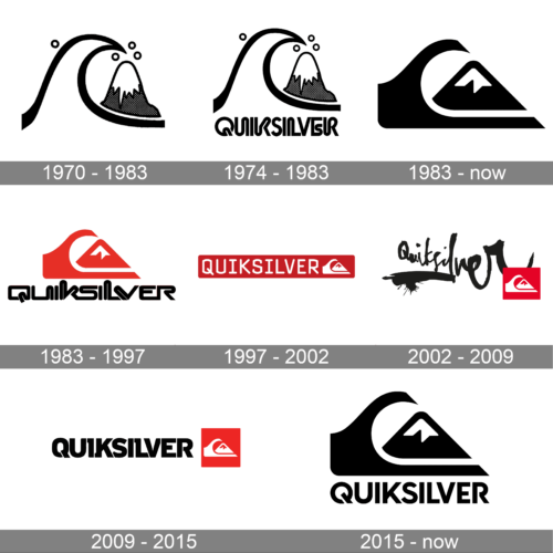
The black and white logo showcases a brilliant juxtaposition of a cresting wave and a towering mountain. Elegantly depicted, the wave’s forcefulness is symbolized by its wide curve, indicating movement and energy. The mountain, with its dotted shading, emphasizes stability and a firm foundation. Together, they encapsulate a sense of adventure, be it on the snowy peaks or the crashing shores. The multiple bubbles or orbs floating above could signify ideas, innovation, or simply the spray from the mighty wave.
1974 – 1983
A timeless emblem of surf and snow culture, this logo integrates the brand name “Quiksilver” in bold, assertive typography. The lettering is underlined by a distinct graphic – a wave encompassing a mountain peak. This synthesis represents the convergence of sea and mountain, hinting at the brand’s roots in both surf and snow sports. The entire design, rendered in monochromatic tones, reflects simplicity, ensuring easy recognition and capturing the essence of outdoor adventure.
1983 – Today
The initial Quicksilver logo was introduced in 1969 and can still be seen on the products of the brand. The owners of the brand took Mount Fuji as the main motive for the emblem, and placed it on the right from a bold stylized wave, combining two main directions of the Quicksilver — water and mountain sports. Both elements were drawn in solid black, and the mountain was covered by the wave. Throughout the years the emblem could be seen on its own or accompanied by black or red inscriptions in different typefaces.
1983 – 1997
This vibrant logo version exhibits the Quiksilver brand in an audacious red tone, exuding energy and passion. The wave, stylized in a sleek and simple manner, arches over a mountain, encapsulating the brand’s connection with the sea and the land. The red hue not only grabs attention but also radiates warmth, perhaps alluding to the sunny beaches and fiery passion of surfers. The brand name, written in contemporary typography, anchors the design, making it a memorable emblem of sporting excellence.
1997 – 2002
For a few months, in the spring of 2010, Quicksilver had been using a red and white logo, with the uppercase modern serif logotype set on the left from the white emblem, on a horizontally stretched solid red rectangle. The emblem was smaller than in the previous version, and the main part was played by the inscription, which was something new for the brand.
2002 – 2009
Later in the same year, the logo of Quicksilver was redesigned again. The new version still can be seen on the products of the brand, along with the original version, designed at the end of the 1970s. The emblem was still set in white on a solid red background, but this time it was more square. The bright badge was placed on the bottom right corner of the logo, overlapping the last letter of a bold black logotype, handwritten in a custom and cool font.
2009 – 2015
This design comprises the word “Quiksilver” rendered in bold, confident typography alongside a red square emblem. The typeface is chunky and unapologetically modern, emphasizing the brand’s contemporary nature. Adjacently, the red square stands out, not just for its vibrant hue but for the encapsulated wave and mountain silhouette, signifying the union of aquatic and terrestrial adventures. This pairing of text and symbol evokes a sense of movement, passion, and limitless exploration.
2015 – now
Distinctly different from the previous designs, this logo vertically aligns the Quiksilver name with a significant graphic representation above. The wave, more abstract in this depiction, transitions smoothly into the mountain, suggesting harmony between different terrains. The choice of black color lends an air of elegance and universality, ensuring that the logo remains iconic in diverse settings. The incorporation of the emblem within the text reinforces brand identity, creating an enduring visual impact.


