Quem Disse Berenice is the name of the cosmetics brand, which was established in Brazil in 2012 by Grupo Borticario. Today the label operates all over the country, having its website with the whole range of products available for international customers. The brand’s main specialization is make-up items, but it also sells fragrances and beauty accessories.
Meaning and history

The philosophy of the Brazilian cosmetic brand has always been based on friendliness and playfulness. Starting with its funny name Quem Disse, Berenice? which is translated from Portuguese as “Who Said Berenice”, and finishing with its colorful products, everything about the label is memorable and cool.
2012 — 2019
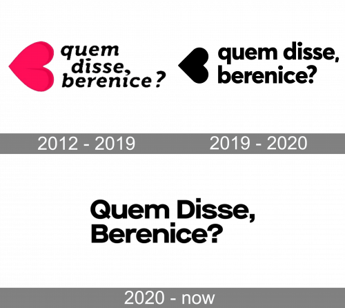
The very first logo for the company was introduced in 2012 and featured a cursive inscription in the lowercase, set in three levels, with a bright fuchsia emblem on the left. The iconic emblem is a horizontally placed heart, with its peak pointing to the left. It looks girly and fancy, reflecting the brand’s purpose and the colorful palette of its products.
As for the lettering, on the first version, it was executed in a smooth and bold cursive, with thickened ends of the lines and rounded edges. The inscription was bright and solid, balancing the enlarged pink emblem.
2019 — 2020

The redesign of 2019 kept the original composition but elevated and modernized it. The heart emblem today is smaller and features more sophisticated contours. The color of the image is now black, which looks trendy and stylish.
The Quem Disse Berenice wordmark is now set in just two levels and executed in an ExtraBold sans-serif typeface with thick lines and clean edges. The only thing about the inscription that was left untouched was the lowercase all the letters are written in. It makes the whole logo more friendly and welcoming.
2020 – Today

In 2020, the brand designers introduced a new logotype. Now it was a simple wordmark with the brand name without any hearts. The font used for the logo was the same as in the previous variant, but this time the first letters of each word were uppercase.
Font and color
The typeface of the brand’s logo is a pretty traditional and solid sans-serif, which is very similar to such famous fonts as Avenir Next Pro Bold, Azur Extra Bold Rounded, and Sultan Nahia regular, which all look professional and powerful.
The monochrome color palette is a big step forward from the bright pink of the first logo. With the strict black and white the brand’s logo started looking more luxury and fundamental, evoking a sense of expertise and authority and representing the label as a professional and confident one.


