Qatar Airways Company Q.C.S.C. has its headquarters in Doha. The flag carrier of Qatar belongs to the state. Taking this into consideration, you will not be surprised by the fact that the Qatar Airways logo uses national symbols.
Meaning and history
Qatar Airways was established in 1993, but until 1997, was a small regional airline with only four planes in its fleet. Although, by the end of the 1990s, Qatari government decided to turn Qatar Airways into a national global carrier that would provide the Middle Eastern country of less than 3 million people with a large flow of transit passengers.
Akbar al-Baqer, then head of Qatar’s civil aviation department, was charged with carrying it out. In 20 years, the Qatar Airways fleet has grown more than 25 times, in fiscal year 2017, the company carried 32 million people.
Today, the airline flies to more than 160 destinations, all of which are international. Qatar Airways is among seven airlines with the highest five-star rating by the British agency Skytrax. It is a member of the passenger airline alliance Oneworld.
What is Qatar Airways?
Qatar Airways is is the national airline of Qatar, which is known throughout the world. The headquarters of the airline is located in the city of Doha. Qatar Airways experienced two births, in 1994 and in 1997. The first date refers to the first flight. The second is related to Emir Hamad Bin Khalifa Al-Sani, who led a series of reforms in the country, including the airline.
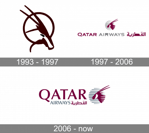
1993 – 1997
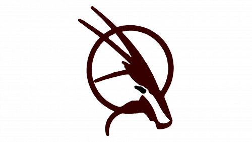
The logotype this company used at the start was a depiction of the company’s mascot, the Arabian Oryx. Its head was incorporated into a circle. Both the circle and the head had a uniform dark red color palette, which stayed with the brand into the future. The background for the whole logotype was colored white.
1997 – 2006
The initial badge of Qatar Airways was created in 1997 and stayed with the company for nine years. The color palette and main symbolism of the visual identity did not differ from the ones we all can see on the current logo of the air carrier. The burgundy and gray scheme, delicate and elegant lettering set in one line under the graphical emblem with the company’s mascot and symbol of speed, the Arabian Oryx, drawn in profile on a gray and white circle.
2006 – Today
For instance, the creature depicted in the emblem is Arabian oryx, the national animal of Qatar. While it is an unusual choice for an airline (airlines typically opt for birds), it is a good way to symbolize speed.
While the color dominating the design is not exactly the one used in the National Flag of Qatar, it looks rather close.
However, the design itself is unique due to the choice of type and the way the oryx is depicted.
Font and color
The main part of the air carrier logotype is taken by the “Qatar” lettering in the uppercase, written in burgundy in a classy typeface, which looks very similar to Optima Pro Demi Bold or Jalal Light. Under the main part of the inscription, there is an “Airways” tagline, which is set in the smaller letters, in the same typeface, but in a light gray color. The gray line of the logotype is accompanied by the name of the company in Arabic, written in burgundy.
The sophisticated and rich color palette of the Qatar Airways visual identity stands for excellence and professionalism. It evokes a sense of trustworthiness, safety, and high quality of services, which the company aims to provide its customers with.


