Puma is one of the oldest companies in the world of sports, and its logo with the black wildcat in the jump is one of the most recognizable emblems in sports’ identity history. The company began with a simple family quarrel between brothers, which resulted in the formation of not one, but two legendary Brands – Puma and Adidas.
Meaning and history
Puma is one of the oldest manufacturers of athletic shoes, clothing, accessories, and other workout equipment. The brand appeared after a quarrel between two brothers who founded the Dassler Brothers Shoe Factory in 1924.
By 1924 the Dassler family registered the company under the name Dassler Brothers Shoe Factory. A year later, one of the members of the firm invented soccer cleats with spikes, which had not previously been produced anywhere else. The shoes turned out to be not only comfortable but also perfectly suitable for sports. Therefore, this model became the main product of the company. The business was growing rapidly and with it the profits. It allowed the brothers in 1926 to establish theirlarge factory, which began mass production of shoes.
After the conflict, happened between the brothers in 1948, the company split into two parts. One of the brothers called their firm Addas (later renamed Adidas) and the second – RuDa.Subsequently, RuDa changes its name to Puma.
In the same year, Puma launches its first soccer boots called Atom. And already in one of the first soccer matches that took place after the Second World War, several players of the national team give their preference to the boots from Rudolph, performing in them in competitions.
Since then, the company has been steadily producing new models, giving its customers innovative solutions in both silhouettes and materials. However, despite all the successes by the nineties the company was on the verge of bankruptcy. Sales and brand creation were on the back burner. Consumers’ opinion of the brand was negative – they considered it inexpressive and imitative.
A new CEO, Johan Seitz, came to the company’s rescue. And in a short time, he managed to bring back the former glory of the sports brand, presenting it in a new light, and making the Puma logo one of the most recognizable in the world.
The birth of the Puma Logo
The wildcat has been depicted on the company logo since it was renamed. The idea of this naming was, of course, the agility and speed of the wild cat; the association with impetuosity, and freedom. And in fact, the name of the new brand was originally formed from the name of its founder.
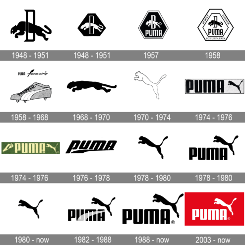
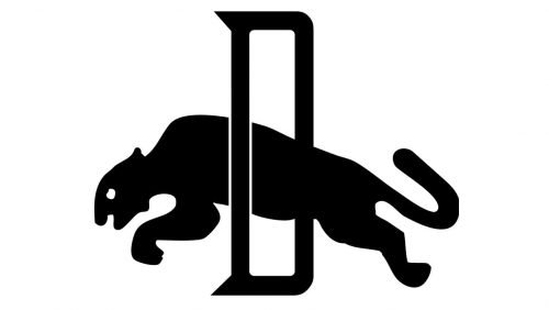
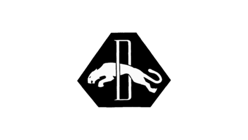
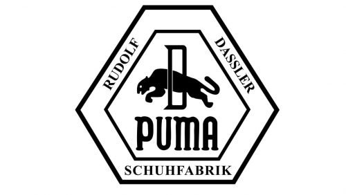
So, since the first appearance of the cat on the Puma logo several small changes were made. The first two versions of the logo had the shape of an irregular hexagon, inside which a puma jumped through an elongated letter “D”. Then the logo became simpler, leaving only the puma itself, frozen in a free leap.
The initial version of the famous logo of the jumping animal was invented by Rudolf Dassler, the founder of the German brand. The choice of this particular representative of fauna is not accidental. The owner of the manufactory thought that clothes and equipment produced by the company should evoke associations with the character of a graceful predator: flexibility, agility, speed, and endurance. Rudolf was convinced that these traits are inherent to all people who are into sports. And PUMA clothes and other accessories will help them to achieve their goals.
The first draft, by Rudolph Dassler, was not very solid. The schematic sketch did not inspire confidenceand was not distinguished by an attractive and presentable appearance. For this reason, the company decided to engage the services of a professional. The choice fell on Lutz Backes, a well-known German artist, and designer at the time. It was he who came up with the emblem, which later became recognizable in every corner of the world.
The history of the Puma Logo
As we already mentioned, the logo of the brand has been changed quite many times throughout the years, although, the graceful wild cat has always been a part of the badge, except for just one version, which was in use by Puma for two years in the 1970s. But that design also means a lot for the company, and its thick black line, coming upright and getting narrower to its top, is still used by the brand for decorating its garments and footwear.
What is Puma?
Puma is the name of a popular brand of sportswear and footwear, which was established in Germany in 1948, and by today has grown into one of the world’s largest companies in its segment, with the Puma boutiques located on all continents, and its products distributed all over the globe.
1948 – 1951
The very first logo for Puma was introduced in 1948 and boasted a monochrome image, where the black graceful wild cat was jumping froth a sharp and narrow letter “D”, which also featured black colors but was outlined in white.
The brand also used a reverse color version of that badge, placing a white animal with the letter on a black hexagonal background.
1948 – 1951
The colors of the Puma badge got reversed in 1948, with the white cat, jumping through a stylized white letter, drawn on a solid black hexagon with the horizontally extended base. This version of the logo only stayed active for less than three years, getting some refinements in 1951.
1957
The redesign of 1957 has turned the cat and the letter black again, with the hexagon becoming white, and all the outlines black. The figure was now enclosed into a thick white frame with the black serif lettering written around its perimeter in capital characters.
1958
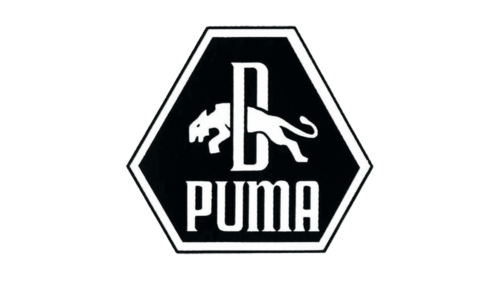
The redesign of 1951 brought more geometry and lettering to the original logo, enclosing it in a double hexagonal frame, where the “Rudolf Dassler Schufabrik” inscription was placed around the perimeter.In the middle of the badge under the leaping cat image, the “Puma” wordmark was written in a bold black typeface with rounded lines.
It was the most geometric badge, ever used by the brand, and the wild cat here was too small to represent all the Dassler’s ideas of gracefulness, flexibility, and endurance.
1958 – 1968
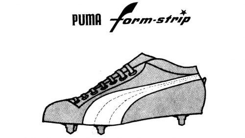
In 1958 the brand used its logotype along with the new emblem, which began to be placed on all the label’s shoes — a smooth and elegant form-strip, a curved line, which got narrowed to the top. Until today the company uses this minimalistic emblem on their garments, as as a signifier on most of the sneakers, produced under the Puma brand. This symbol got as popular as the Adidas stripes or the Nike swoosh.
1968 – 1970
The black cat came back to the brand’s visual identity in 1968, and it was the only element of the logo, to have its original contours refined and cleaned. It was a minimalist emblem, which only stayed with the company for two years, and later was a little modified.
Rudolf’s son, Gerd Dassler, was friends with cartoonist Lutz Backes. It was he who was commissioned to design the new logo for Puma. Backes was offered a cent for each brand item sold with his creation, but he decided to simply take 600 marks from the company. In addition, he received a pair of shoes and a sports bag.
1970 – 1974
The puma started being placed more vertically in 1970. This is when the actual predecessor of the current iconic badge was born. Its main color was switched from black to white and the animal’s silhouette gained a delicate black outline, which made it look even more graceful and elegant. This was also one of just three Puma badges, drawn without any lettering.
1974 – 1976
The leaping cat becomes black again and is placed on the right from the enlarged bold wordmark in a custom sans-serif typeface with rounded angles of the letters. The composition is placed on a light background and enclosed in a horizontally stretched rectangular frame.
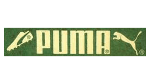
Another color palette was used by the brand during this period — wight yellow lettering and an icon on green background, a fresh and bright combination, standing for growth, progress, and motivation.
1974 – 1976
Another version of the Puma badge was introduced in 1974, staying with the sportswear manufacturer for just a couple of years. It was a horizontally-oriented rectangular banner in green, with the pale yellow lettering in the center; the image of a leaping cat in yellow, on the right, and the drawn football boot in yellow and green, placed diagonally on the left from the inscription.
1976 – 1978
The form strip replaces the cat again in 1976, being placed under the italicized logotype in the lowercase, executed in thick lines of a modern yet pretty simple sans-serif typeface, with the vertical bar of the “P” elongated.
1978 – 1980
One of the Puma badge versions, used by the brand in the end of the 1970s, was composed of just a solid black emblem with the leaping wild cat, drawn against a plain white background with no additional elements. It was exactly the same puma, as the one, drawn on the badge from 1974.
1978 – 1980
The letters of the logotype got capitalized again in 1978, and the leaping puma came back in the same year. It was an initial logo we all can see today. The cat in black was placed above the upper right dinner of the wordmark.
1980 – Today
The brand also started using just the puma symbol with no additional in 1989, and this is the icon we can still see today, with perfectly cleaned and softened contours of the wild cat, which point to elegance, timelessness, and professional approach of the company.
1982 – 1988
Another version, created in 1989, featured a combination of iconic Puma symbols, a forms trip, and a leaping cat, adding a light gradient image to the logotype, and keeping the jumping animal in its place.
1988 – Today
Today the brand still uses its logo, introduced in 1988, which is almost a copy of the 1980’a version, but with the lines of the letters straightened and softened. The smooth and chic typeface makes the whole image look sleek and exquisite, adding a sense of reliability and expertise to all of the brand’s qualities.
2003 – Today
The redesign of 2003 has kept the main elements of the Puma visual identity untouched, but worked with the color palette, creating an intense and bright logo with the solid red background and heavy white letters and an emblem on the right.
Font
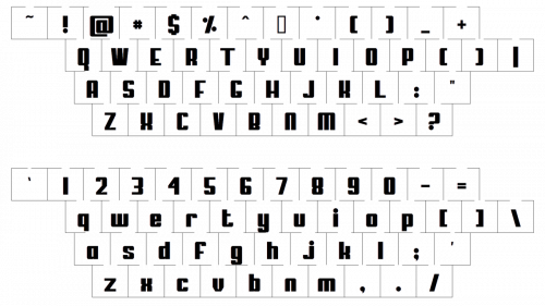
The typeface used in the current wordmark somewhat resembles the one that was created in 1957 by Rudolf Dassler. Again, round shapes dominate, and there are no sharp angles. However, the current typeface is more solid and the letters have been slightly altered.
The closest commercial fonts to the one, used in the Puma insignia, are, probably, Quandor Regular, or FF Softsoul Std Bold, with some significant modifications of the contours.
Color
Typically the Puma logo is given in black against a white background. However, in case the context requires another color choice, it is possible to see the logo of the brand set in white lines against a solid red background, or in a dark navy and white color palette. All of the versions look equally strong and progressive.
Why did Puma choose their logo?
The puma appeared on the logo of the brand from the very beginning of the company. The leaping animal is a representation of motion and power, it also depicts freedom and speed, the qualities, which are strongly connected to the sport.
Why is the Puma logo black?
The minimalistic color palette of the Puma visual identity, black and white, allows placing the badge on any background, without losing its recognizability and strength. Black is a color of excellence and stability, which also elevated the image of the company in the eyes of the customers.


