Pull & Bear is a Spanish fashion brand, oriented on the low and medium price segment, which was founded in 1986 under the name “New Wear”. Today the brand is a part of Inditex, which also owned Zara and Stradivarius.
Meaning and history
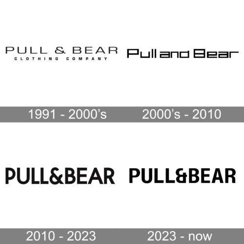
Pull & Bear got its current name in 1991, in same year the brand’s first logo was created, and remained untouched for almost twenty years.
The company undergone redesign in 2010, the logo was changed, as well as Pull & Bear stores decorations. After the new logo was created, the brand launched its online store.
1991 – 2000s
The original Pull & Bear logo was an all-caps wordmark with geometric and a little futuristic typeface. The lines of the letters wire fine and confident. The top part of the ampersand on the logo is opened. The logo features a “ Clothing Company” tagline, which is executed using the same family of the font, just narrowed.
2000s – 2010

At the beginning of the 2000s, the Pull and Bear logo was redesigned in a more geometric and futuristic way, although the lettering remained the only element of the visual identity. It was a title case wordmark with the “P” and “B” capitalized, and the ampersand replaced by the “and”. The new typeface looked progressive and unique, with all letters drawn in square shapes, contours cleaned and cuts straightened.
2010 – 2023
The new Pull & Bear logo is more elegant. It is still composed of a wordmark and the monochrome palette remained, by the change of the typeface made it look more rich and sophisticated.
The current logo uses a classic font which is close to Avant Garde Gothic Demi Bold. It is geometric, decent and adds a feel of luxury to the nameplate. The brand’s iconic ampersand remain opened on its upper part, but its lines became softer and the curves are full of grace.
2023 – now
The update to a logo used for over ten years was so minimal that many would not even notice the changes. However, when two versions are set side by side, one can instantly see that the font has been modified. First of all, the letters no longer look as wide with the exception of the “L”s, which got wider to create a balanced look. The “&” sign also looks different. the other noticeable change is the curved leg of the “R”. These subtle updates gave the logo a more welcoming appearance.


