ProtonMail is the name of an encrypted e-mail service based in Switzerland and created in 2014 by scientists, engineers, and developers at CERN to improve your online security and privacy. They pride themselves on their data centers, located a thousand meters deep in granite rock in a heavily guarded bunker capable of withstanding a nuclear attack.
Meaning and history
Over the past few years, ProtonMail has become incredibly popular, overtaking many competitors with higher-profile names. And all the success was gained due to the truly high level of protection and security, ProtonMail provides its users with. In terms of visual identity, the service has also been stable and confident, brilliantly representing the main priority of the provider.
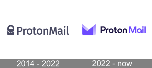
2014 – 2022

The ProtonMail visual identity was created in 2014 and stayed with the e-Mail service provider for years, as a great graphical representation of confidence, security, and protection of data. The logo is executed in a dark and solid color palette, with an intense and deep shade of blue for both logotype and emblem.
The ProtonMail logo is composed of a delicate yet strict and stable emblem, followed by a bold sans-serif logotype on the right. The inscription has two parts of the name written in the title case, with “P” and “M” capitalized. The two parts are written without any additional space between them.
The main part of the ProtonMail visual identity is, definitely its emblem, which also works as an icon and the service’s signifier. It is a stylized lock, which has a traditional rectangular envelope replacing its bottom part. The “handle” of the lock is smooth and bold, which perfectly balanced the heaviness of the bottom lock part.
2022 – Today
The ProtonMail logo redesign, held in 2022, has shown the progressiveness and development of the mail platform, by creating a sleek and very stylish badge in a purple and black color palette. The new emblem is composed of two purple layers, the solid one, and a transparent gradient one, which together forms a geometric figure with the triangular cut-out in the upper part, making up a stylized envelope; and a bold sans-serif wordmark in the title case, with the “Proton” set in black, and “Mail” — in purple.


