Proton is the name of an automobile marque from Malaysia, which was established in 1983 by Mahathir Mohamad. Today the company, owned by DTB HICOM and Zhenjiang Geeky has seven car models, which are mainly distributed in Malaysia, though the brand is constantly expanding to other countries.
Meaning and history
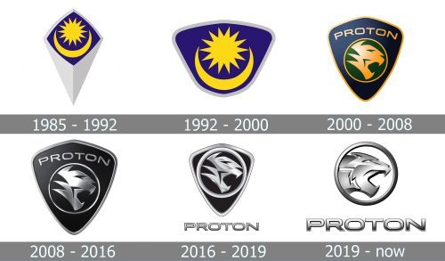
The evolution of the Proton logo is truly impressive, as the brand started from Malaysia, oriented only on the local market, so the first two badges were about the country’s legacy and religion, depicting the main Muslim symbols.
With the company’s expansion to the west, the logo was changed to a completely different one, adopting an animal image as the main theme, and it worked well, representing the power and courage of the marque.
1985 – 1992
The very first Proton logo, introduced in 1985, was composed of a rhombus with its bottom part elongated, and upper part colorful. The silver badge contained an image of a yellow star with a yellow moon placed under it horizontally. Both symbols were located on a blue background. The more mark in the lowercase was written in a custom font, resembling Arabic lettering, and placed under the badge.
1992 – 2000
In 1992 there were three different badges designed for the brand. One, with the star and the moon, was used only on the local market, while two others — white and yellow mandalas in a deep blue background — were placed on the exported cars. The wordmark was sometimes used with the badges and was repeating the design of 1985 but in bolder contours and a darker shade of blue.
2000 – 2008
2000 became a year of a huge rebranding for the company. The new symbol was adopted — now the Proton badge was composed of a dark purple shield with a thin gold outline and a green circle in the middle. The circle was also outlined in gold and had a stylized sharp image of a tiger, turned to the right with its mouth open. The symbol of strength and courage the animal looked modern and stylish, showing the progressive approach of the brand.
The wordmark was placed inside the crest, above the rounded emblem, and written in all capitals of a lightweight sans-serif typeface, having a glossy golden texture, which added volume and motion to the whole image.
2008 – 2016
In 2008 the color palette of the badge was switched to black and silver. The three-dimensional emblem started looking more brutal and solid and suited any color of the car it was placed on. The lettering was slightly on larger and thickened.
2016 – 2019
The wordmark is being removed from the crest and placed under it in 2016. All contours of the badge have been redrawn and made thicker. The silver parts of the emblem gained more gloss and started looking even sleeker. As for the wordmark, it was executed in a bold sans serif, using the same gradient metallic palette, but featured a thin black outline, which made it solid and distinct.
2019 – Today
In 2019 the shield was removed from the Proton visual identity, and now it features only a circular emblem, where the redrawn tiger with its mouth open, is enclosed in a thin silver frame. The wordmark is placed under the badge and uses the same color palette, which looks balanced and fresh.
Font and color
Proton had a long path from ornate lettering to bold and clean sans-serif, which we all can see today. The thick straight letters in a square confident font look massive but do not overload the image, on the contrary, they add a sense of stability and trustworthiness.
As for the color palette, the brand started from blue and yellow, tried purple and gold, and finally came to the most minimalist solution — metallic silver. It looks professional and strict, showing the fundamental approach of the company and its value of customers’ comfort and safety.


