Prevost is a division of Volvo Group and specializes in the manufacturing of premium coaches and motorhomes. Established in 1924, the company has built a reputation for delivering high-quality, custom-made vehicles designed for both private and public transportation. Prevost operates mainly in North America, boasting a strong presence in both the United States and Canada. With various service centers and a network of parts distribution, the company aims to provide seamless service to its customers.
Meaning and history
Founded in 1924 by Eugène Prévost, a cabinet maker specializing in church pews and school furniture, Prevost has evolved into a leading manufacturer of premium intercity touring coaches and high-end motorhomes. Initially focused on wooden bodies, the company has transitioned into crafting state-of-the-art vehicles known for their durability, quality, and safety features. Significant milestones include the launch of the H-Series, lauded for its industry-leading design and technology, and becoming a division of Volvo Group in 1995. Currently headquartered in Quebec, Canada, the company predominantly serves the North American market. Prevost remains committed to excellence, evidenced by their extensive network of service centers and parts distribution facilities that ensure a high level of customer service and satisfaction.
What is Prevost?
Prevost is a Canadian automaker specializing in the production of high-quality coaches and luxury motorhomes. Founded in 1924, it is a division of Volvo Group. The company predominantly serves the North American market, offering vehicles designed for both public and private transportation.
1924 – 1989
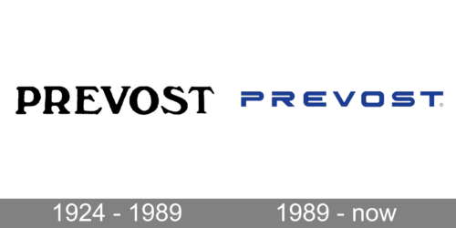
The logo of the Prevost brand looks stylish and bold despite its minimalistic design. It consisted only of the brand name. It was printed using a serif Verona Serial Medium font or Windsor Regular font. The black color enhanced the sophisticated, professional, and timeless appearance. All uppercase and closely spaced characters made the brand appear strong and confident.
1989 – now
The logo consisted of only the name once again. This time, the designers used a modified version of Korataki Bold or a similar font. They added horizontal slits in the first two characters to match the horizontal space present in the “E” and “S”. The wide spacing between the letters, as well as the blue color that replaced the black, made the company look poised and well-established. This version turned out very stylish and modern despite being designed several decades ago.


