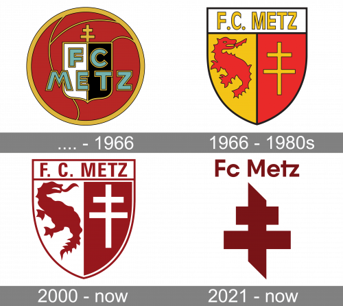
Metz is the name of a French football club, which was established in 1932 through the merger of two clubs. Today the team, nicknamed “Les Grenats”, which means “The Maroons” in English, plays in the Ligue 1 and has Vincent Hognon as the head coach.
Meaning and history

The visual identity of the French football club is very heraldic and has always been like that. With only two major redesigns throughout the club’s history, its emblem hasn’t changed much in terms of colors and mood and still looks classy and strong today.
Until 1966

At the beginning of its history, the club used a rounded emblem, based on a football image. The ball was colored maroon, that is how the team got its nickname. On the circle, there was a black and white shield placed right in the center, with a gold cross Lorraine, one of the most famous heraldic symbols of all time.
The “FC Metz” wordmark in all capitals was placed over the shield, under the cross. It was executed in light blue and features a gold outline, making it look classy and timeless.
1966 — 2000

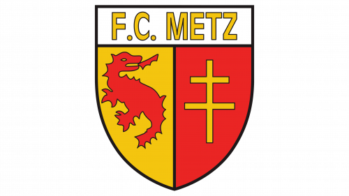
The visual identity design from 1966 was completely different. Now the logo features a classic smooth crest, vertically divided into two equal parts — yellow on the left, and maroon on the right. The upper part of the shield was white and has a gold “F.C. Metz” lettering in all capitals on it.
On the shield, there were two main club’s symbols placed — the maroon dragon on a yellow background, and the yellow Cross Lorraine on the maroon part of the crest.
Both symbols were placed on the logo as a celebration of the club’s homeland. The dragon on the crest is Graoully, a character from one of the Metz’s legends.
2000 — Today

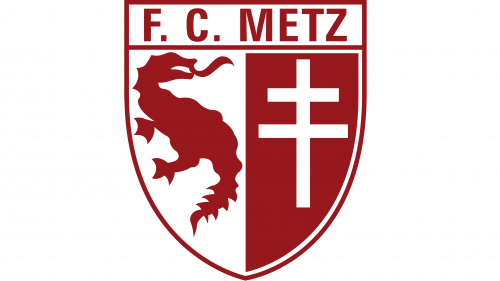
The traditional and classic logo was redesigned in 2000, in order to give the crest a more modern and contemporary look.
The color palette of the emblem has been simplified to maroon and white; which made the whole image look stronger and more progressive. The lines and contours of the logo have been cleaned and modified: the dragon was enlarged and got it is to gout elongated and more visible now, the Lorraine Cross became bolder and more confident.
As for the wordmark, now it was in maroon, placed on a white background, and ex-ecuted in a sharp and bold sans-serif typeface with clean lines and distinct cuts of the edges.
The FC Metz logo is simple yet every symbolic and reflects the club’s value of its roots, traditions, and legacy. The warm yet bright color palette of the team’s visual identity reflects their passion for football and willingness to win.
2021 — Today

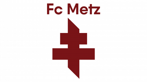
The 2021 logo used a new sort of cross. It was much thicker and cut on the top and the bottom, making the tips look pointed. The team’s name was placed above, using a normal sans-serif font. Both parts were burgundy-colored.


