

![]()
Portland Timbers logo PNG
Portland Timbers is the name of a football club from the United States, which was established in 2009 in Oregon. Today the club also knows as “The Timbers”, is owned by Peregrine Sports company and has Giovanni Savarese as the head coach.
Meaning and history
![]()
The visual identity of the Oregon football club has always been very consistent. Its logo, introduced in 2010, has been kept almost untouched, and the main symbol and color palette of Portland Timbers are instantly recognizable not only in the United States but all over the world.
2001 – 2004
![]()
The base of this logo was a tilted shield shape. It was loosely divided in two halves: a black section on the left, and a white section with wavy green lines on the right. The former was also given a white silhouette of a spruce. This emblem was usually crowned with the word ‘Timbers’, written in black right above.
2005 – 2010
![]()
The following design is the one they kept using ever since, with changes. This one is a lime circle with a darker round core. In this core, they’ve carved out lines to make it resemble a leaf, as well as added a silhouette of a hatchet right in the middle. The wide lime expanse around was occupied by the team’s name, written in dark green.
2010
The original emblem for the football club was introduced in 2010. It was a solid green rounded badge with a yellow outline and a white and yellow ax, placed over it vertically. There were six diagonal lines coming from the axe to the sides of the badge.
The “Portland Timbers” wordmark in white and yellow was placed in two levels on the bottom part of the circle, crossing the axe’s handle.
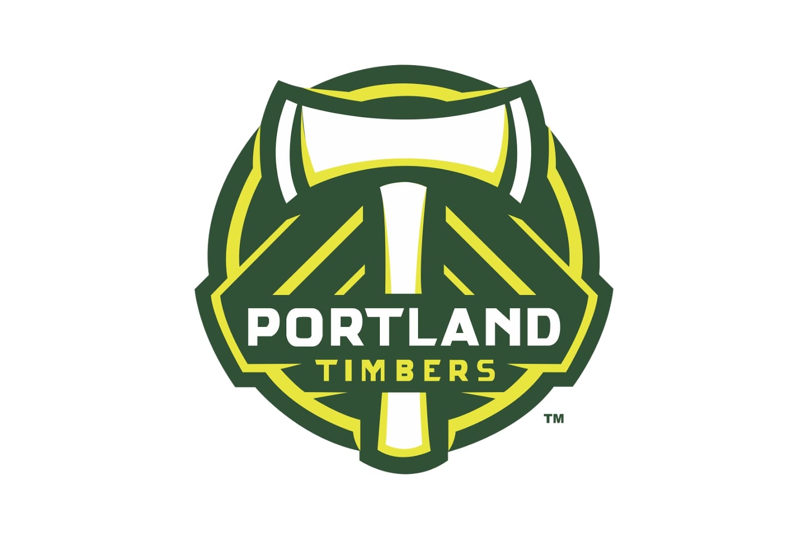
2010 — Today

Later in 2010 the badge was cleaned and refined and became official. The green background gained a darker shade, and the ax became flat white, with no yellow detailed, a modern and minimalist image.
The green, yellow and white color palette of the Portland Timbers’ visual identity symbolizes growth, energy, and loyalty of the club. It is also a celebration of the Or-egon state with its amazing nature and woods.
The logo was used in several versions — one of them was monochrome, another had no wordmark in it, why however the club used it, or wherever it was placed, it was remarkable and recognizable.
2011
![]()
The 2011 is generally the same hatchet composition, except with a perfectly round circle and without the name part. This one was moved outside, onto a big white frame around the emblem in the center. In dark green, there was ‘Portland Timbers’ written above & ‘Inaugural MLS Season’ below. On the sides, the year ‘2011’ was placed in two halves inside small green sections.
2016
![]()
The 2016 emblem uses the hatchet with a green circle behind it, same as in the 2011 logo. However, there’s nothing else besides that, except for a green star looming above the emblem.
2018 — Today
![]()
In 2018 the club goes laconic and removes the wordmark from their badge. Now the Portland Timber’s logo is just a dark green circle with a white axe, vertically placed in its center. The circle has a double dark-gold and green outline, which is balanced by six gold diagonal lines, coming from the axe to the framing of the emblem, three from each side.
It is a minimalist yet very masculine emblem, which shows the strong and serious character of the team, pointing on their motivation, determination, and willingness to fight and win.
Portland Timbers Colors
GREEN
PANTONE: PMS 3537 C
HEX COLOR: #00482B;
RGB: (0, 72, 43)
CMYK: (100, 14, 99, 65)
GOLD
PANTONE: PMS 117 C
HEX COLOR: #D69A00;
RGB: (201, 151, 0)
CMYK: (6, 27, 100, 12)


