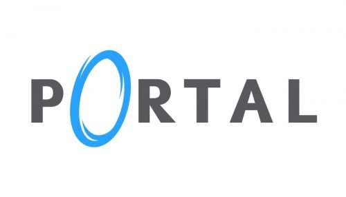
Portal is the name of a Valve online platform which was released in 2007. One of the world’s most popular puzzle video games, it has millions of players across the globe and has two versions released by today.
Meaning and history
2007
The visual identity of the Valve online game is minimalist is trendy, though it was designed in 2007, it looks actual and trendy today. Composed of a logotype with one graphical element in it, the Portal insignia is fresh and inviting.
Once you look at the Portal logo, you instantly understand what the game is about. This text-based emblem represents the character and mood of the puzzle and makes you want to solve it.
The Portal logo in the black and blue color palette of composed of a strict and simple sans-serif lettering, with the “O” replaced by an image. The typeface of all capital letters of the main inscription is very close to Mahsuri Sans Bold font but with a lot of space between the symbols, which makes it look more lightweight and elegant.
The most recognizable element of the logo is its light blue letter “O”, which is drawn like a slightly inclined oval with uneven contours, which makes it look like a swirl or a rounded foot to the portal. Placed on a white background, the “O” works as the trigger to the game and evokes interest and willing to solve the mystery.
The black and blue color palette is very calm and strict, yet there is something intri-guing in the minimalist composition of the Portal logo. It looks confident and solid, making you believe in the creativity of the developers and the high quality of graphics in the game. The logo looks stylish and sleek, despite its laconic lines and shades.


