Polk Audio is a San Diego, California-based company specializing in audio products. Its most popular products are home and automobile speakers.
Meaning and history
Polk Audio was founded in 1972 by Matthew Polk and George Klopfer. The friends shared the dream of creating speakers that could be the best in the world in terms of quality of sound, but affordable. Using the development of scientific methods, which was a rare thing in the 1970s, and focusing only on the production of speakers, they managed to create unique products, which made the company known all over the globe and got Polk Audio a status of the acoustics expert.
Today the most profitable category of Polk Audio products is CI, in-wall speakers for custom installations, and the best-selling category is soundbars. An interesting fact is that almost all of the top managers have been with the company for many years. The main developer Stu Lunsdem has been with the company for over 35 years.
Polk Audio is a company with a rich history, and roots, that are very important for it, and yet has a state-of-the-art research and development department with an experienced manufacturing facility.
What is Polk Audio?
Polk Audio is one of the largest and most successful manufacturers of home and car audio systems. The company was established in the United States in 1972. Today Polk Audio belongs to the American company DEI Holdings, which also unites the brands Definitive Technology (loudspeakers) and Directed (car electronics Clifford, Viper, Python, and several others).
Before 2012

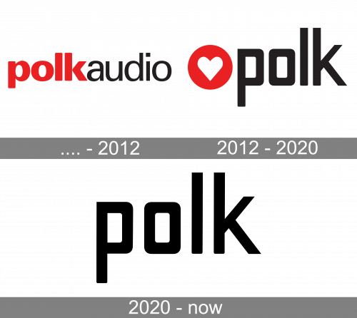
The original Polk Audio logo featured the lettering “PolkAudio.” Although the two words were written without space in between, the color and type helped to break the word down into meaningful parts. “Polk” was red and was given in a bold font, while “audio” was black and showcased a lighter type.
All the letters were lowercase, which, in combination with the rounded ends of the glyphs forming “Polk,” added a friendly, personal touch.
2012 – 2020

The personal theme has grown much more prominent in the modified logo. It has become almost explicit due to the heart emblem that has appeared on the logo. The heart in white is placed inside a red circle.On the one hand, the design looks totally generic both in terms of the shape and the palette. It creates an obvious connotation with Valentine’s Day.
The circle on the emblem can be interpreted as a representation of a speaker. The heart, in this case, can be interpreted as the sound going out of the speaker – the sound you love because of its quality.
The updated typeface features rectangle-based glyphs. The top diagonal bar of the “k” is lower than the tops of the “p” and “o.”
The new Polk Audio logo was developed in collaboration with the San Francisco office of Frog Design, a global design consultancy headquartered in San Francisco, California, United States.
2020 – Today
The redesign of 2020 has removed the graphical element from the Polk Audio visual identity, keeping the cool bold logotype as the basis. The lowercase lettering in thick black lines of a modern sans-serif typeface looked exactly like the one from the previous badge but got its characters slightly enlarged, gaining more air between the lines. The unique Polk wordmark has some of the angles rounded, and others cut straight.
Font and color
The sleek and super-modern lowercase inscription from the primary Polk Audio logo is executed in a custom sans-serif typeface, which has some unique elements, making it individual and special. The font features heavy letters, written in thick lines with half of the corners softened, and the other half — straight and clean. It is a custom typeface, which has no commercial analogs, but the closest available fonts for the one used in the Polk Audio logo are Fosho Book Outlines and Vox Round Bold.
As for the color palette of the Polk visual identity, since 2020 it is only based on a plain black color, with white as the most often used shade for the background. This color scheme makes the badge strong, brutal, and timeless, evoking a sense of excellence and quality.


